AI Summary
Key Highlights of Popular Rebranding Case Studies
This post explores popular rebranding case studies to educate business leaders and marketers on effective brand transformation strategies. The key insight: successful rebranding blends respect for legacy with modern relevance to deepen customer connection. It covers notable examples like Animal Planet, Evernote, Mailchimp, and Uber, illustrating how refreshed logos, messaging, and digital presence drive renewed growth. Readers gain practical understanding of rebranding challenges and solutions, supported by expert quotes and design rationale. The article encourages leveraging these insights to guide strategic rebranding efforts and partner with digital marketing firms for amplified impact and improved market positioning.
Establishing a compelling brand is pivotal for any business, and comprehending the intricacies of branding can be complex. It’s essential not only to understand your brand identity but also how customers perceive your products and services. Exploring brand case studies provides valuable insights, uncovering potential growth avenues based on the triumphs of other businesses. Leveraging the expertise of a reputable digital marketing company can further amplify your brand’s impact through strategic digital marketing services.
Did You Know?
It takes 5 to 7 impressions for people to remember a brand. And what if you were to rebrand the existing one?
Popular companies that were looking to rebrand often found it difficult because the old name was already established. The problem with this is when you are trying not only to establish your new brand but also live up the expectations of existing customers who have grown accustomed to buying from that particular business or industry category over time.
A lot goes down during this step: from researching companies’ history (both past successes/failures), coming up with new ideas about logo designs.
Here at ColorWhistle, we have curated a list of popular (non popular but useful ones too) rebranding case studies that you can refer to, when you are looking to rebrand your brand.
Also Read
Inspirational Rebranding Case Studies
The rebranding process is a lot like an organism that evolves over time. The goal for any brand, whether they’re doing well or not so much in their market space, is to be able to find ways of improving on what’s already there and sometimes this means changing how you look from head-to toe!
As seen with many brands that’ve gone through major transformations such as Nike Inc., Redbull, Target etc.. Let’s have a look at some popular rebranding case studies to have a better vision of what worked and what was the thought process behind rebranding.
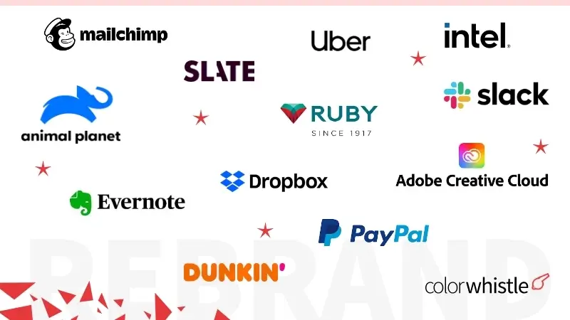
Here are a few case studies showcasing inspirational rebranding efforts, including notable examples from
- Animal Planet
- Evernote
- Mailchimp
- The Ruby Mills
- Slate
- Uber
- Dunkin
- Dropbox
- Slack
- Intel
- Paypal
1) Animal Planet
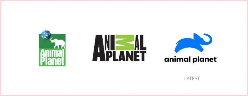
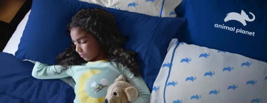
The new logo and tagline for Animal Planet is “Bringing people up close in every way,” which really tells the channel’s story. The graphic reflects this mission statement with an elephant, just representing the mood of the brand!
Animal Planet has been a much-loved brand around the world for more than 20 years and the time has never been more right to engage with mass audiences across every platform who are as passionate about animals as we are.
– Susanna Dinnage, Animal Planet’s Global President
2) Evernote
Rejuvenating a well-loved brand is no easy task. But it’s critical to ensure that the refreshed, revitalized product resonates with customers and speaks directly at their hearts in order for them not only stay loyal but increasingly come back again and recommend your business or organization to others.
Your products should reflect what you stand for as an organization so they can speak volumes about who are trying new things while still holding true on key values like quality, durability & affordability; also ensuring there’s room left over just because people want more than anything else truly meaningful when engaging digitally these days
Evernote’s brand rejuvenation is a clear example of well crafted rebranding strategy.
Throughout the process of evolving our brand, we have looked to our past for inspiration for our future. We started as a place to remember everything, and that will never go away. Our brand now reflects our broader purpose.
– Chris O’Neill, Evernote’s CEO
Also Read
3) Mailchimp
Mailchimp’s branding was a bit outdated and they needed a complete rebranding. They also wanted their website updated so customers could find them easily on different devices like tablets or smartphones instead of just desktop computers.
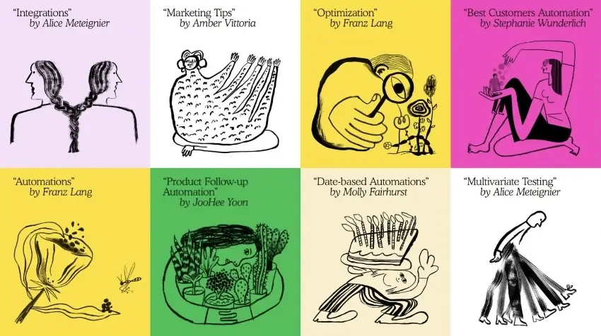
With this redesign, we set out to retain all the weird, lovable elements that endeared our earliest customers to Mailchimp, while creating space for the brand to grow and connect with even more small businesses. We didn’t want to lose our heritage in the process, so we focused on capturing the essence of what Mailchimp has always been.
– Mailchimp’s Blog
Also Read
4) The Ruby Mills
Ruby Mills teamed with a digital agency to rebrand itself and showcase it as a part of the new trending modern digital space. The logo was refurbished to reaffirm the legacy of the brand in a contemporary manner, and yet keeping the visual language flexible enough for digital (online) & offline media and product representation.
The brand name connoted preciousness and gave us a solid foundation to work with. The new identity was found completely aligned to the Ruby legacy and its progressive future.
– Elephant Design, Digital Agency
5) Slate
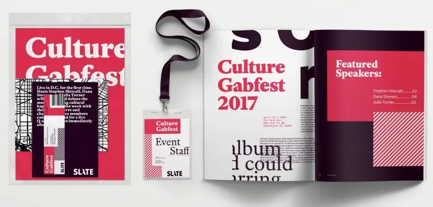
Slate’s Logo needed a revamp as their logo was outdated and needed a refresh to match the new industry standards. The logo was reimagined and cleaned up for a more distinct look. The “A” is being revealed, uncovering its true form in an elegant manner that hints at all those who have come before it.
Our approach was to visualize Slate’s story-making process with a language that feels like sifting through the news, looking for hidden clues and cracking the code that blows open the case.
–Gretelny, Design Studio
6) Uber

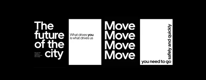
Uber was famous for its inverted U in their logo and when they decided they needed a brand refresh, There were mixed responses and yet Uber’s logo refresh was a very significant one with more sophisticated typography and branding elements.
Molly Watson, the director of the verbal identity at Wolff Olins San Francisco, said the new logo was designed to represent Uber’s growth and security.
7) Dunkin
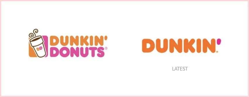
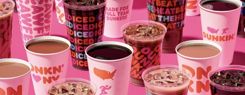
The name dunkin itself reminds us of their bright colors and their fresh look in branding. While rebranding they took a big decision of letting go their second word which is donuts and made a more crispier logo that’s even more recognizable and carried their legacy.
The new branding, developed in partnership with new creative and branding agencies Jones Knowles Ritchie (JKR), BBDO New York and Arc Worldwide, is one part of Dunkin’s multi-faceted blueprint for growth, a plan designed to transform the company into the premier beverage-led, on-the-go brand.
– news.dunkindonuts.com
8) Dropbox
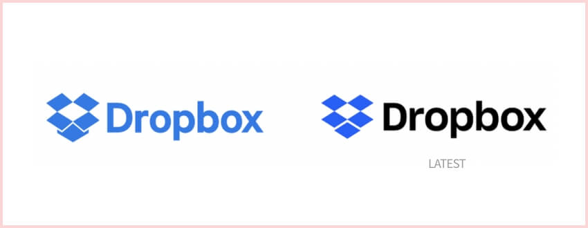
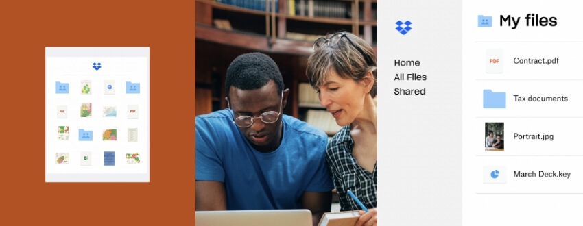
When you’re just starting out, it is enough to create a single image for your company. But as soon as growth starts happening at an impressive rate and new employees start calling in with questions about how things work or what their function might be within the organization, you need to be more aware of how the brand fits the industry. Dropbos decided on a revamp that didn’t change much but yet created an impact.
Our new illustration style picks up where our earliest style—loose, handmade, witty—left off,” write creative director Aaron Robbs and VP of Design Nicholas Jitkoff.
Also Read
9) Slack
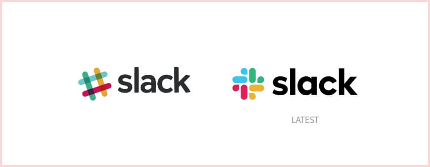

Slack always had an eye of detail in their logo. The hash in their logo was very popular for the kind of brand it was. Yet slack decided to rebrand and give a fresh look to their logo to adapt more into the trend and industry. The new logo looked fresh and more adaptable to the brand statement of Slack
It uses a simpler color palette and, we believe, is more refined, but still contains the spirit of the original. It’s an evolution, and one that can scale easily, and work better, in many more places.
–Slack Team
10) Intel
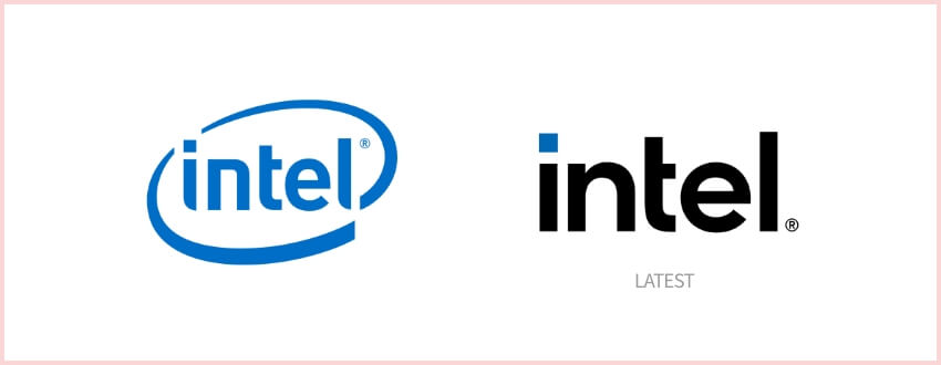

Intel with the ring is what comes to mind when one thinks about the brand. Intel decided to give a brand refresh while continuing their brand vision and brand statement. They believed that this refresh will help them connect more to their customers and do something wonderful.
The new logo represents a dramatic simplification of the Intel brand identity. Crafted with an underlying geometry, the logo has a refined symmetry, balance, and proportion that is understated and iconic.
–Team Intel
11) Paypal
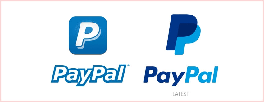
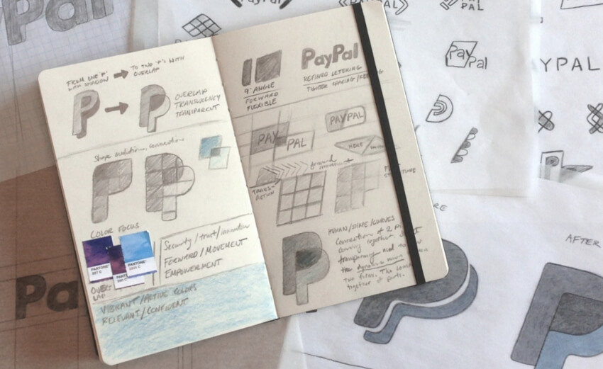
PayPal is a digital payments company known for its bold and progressive innovations. With all the exciting changes in the industry, they considered creating an even more creative expression of PayPal—the original innovator that started it all!
“At PayPal, we always strive to lead as a revolutionary brand. With our rapidly changing environment, we must create based on the needs and changes in the marketplace,” said Christina Smedley, vice president, Global Brand and Communications, PayPal.
Looking for Website Redesign Services?
Seize and experience the transformative impact of Website Redesign Services & Solutions with ColorWhistle.
Winding Up
The importance of branding/rebranding case studies to understand the process cannot be overstated.
These case studies provide an excellent and detailed look at how different brands were able to successfully navigate their own unique challenges, which will ultimately translate into success for your business in various aspects ranging from digital marketing efforts through customer service interactions with clients or employees alike!
Looking for rebranding services? Contact Us
The rebranding process is a lot of work, but it’s worth the effort. Case studies show that when you take on this challenge and succeed in your goal to make an improved version of who we were before-only then will people see how great the new branding really does help to achieve better positioning within markets.
This is where website redesign packages come in. Our packages can help you create a website that seamlessly integrates your new branding, strengthens your customer experience, and drives results. The benefits extend beyond just business leaders – a well-designed website empowers your entire team with a clear and consistent brand message.
-Sankar, CEO at ColorWhistle
In quest of the Perfect Website Redesign Solutions Buddy?
Be unrestricted to click the other trendy writes under this title that suits your needs the best!
- Website Redesign Journey of ColorWhistle – How We Achieved 100% Performance!
- Web Application Redesign – Things to Consider Before Starting
- How to Redesign a Website Without Losing SEO?
- Website Redesign Checklist: 9+ Things to Consider Before Website Redesign [PDF Download]
- Website Redesign Complete Guide
What’s Next?
Now that you’ve had the chance to explore our blog, it’s time to take the next step and see what opportunities await!
