Modern Website Design & Development for Real Estate – Do’s and Dont’s
Real estate website design and development is an art.
From choosing the right color palette to ensuring proper navigation, you have to give attention to even the small details to build a strong website.
With the online webspace thriving with unique real estate websites, making your website stand out is honestly not going to be a picnic. But, don’t worry, there is hope.
Thanks to experts like ColorWhistle, we can give you valuable insights to make a grand web presence and boost your conversions.
In this blog, we have outlined the do’s and don’ts of creating an effective real estate website which will also give the necessary emphasis on user interaction.
Best Practices for High-Converting Real Estate Websites
Here are some awesome best practices that will take you a long way in designing a real estate website that is optimized, convertible, and actionable. Even if you outsource your real estate web design & development to professionals, make sure you ask them how they handle the following aspects.
The aim of marketing is to know and understand the customer so well the product or service fits him and sells itself.
Peter F. Drucker
Target Audience
Don’t ignore users
When designing a real estate website, you must always keep your target audience in mind. Your views as a real estate agent will be different from that of a user. Remember, your shiny new website will be of no use if it does not appeal to the users who will be using it. So, pretend that you are a user and walk through the pages from their point of view. By focusing on experience, you will be able to create a website that is beneficial to users and search engines.
Do focus on optimizing for search engines
If you have a real estate website that does not rank well in search engines, then you have no chance of cutting through the clutter. When you revamp your website, or add new features or create a new website, make sure you follow the SEO guidelines such as usage of proper keywords, on-page factors, off-page factors, the load time of the website, mobile responsiveness, and more. You can also get help from SEO experts to optimize your website professionally.
38% of people will stop engaging with a website if the content or layout are unattractive.
Hubspot
Also Read
Layout
Don’t clutter the layout
Leonardo da Vinci said, “Simplicity is the ultimate form of sophistication.” You must follow this same mantra when creating your real estate website. Designers will love to get creative and sometimes it may get messy. So always put yourself in the users’ shoes and think. When there are too many elements on a page, all of them will be competing for the user’s attention and it will hinder the buyer’s journey.
Do create a focal point
You only have a few seconds to capture the attention of your website visitors. So, your real estate website must include clear focal points that draw attention to the most valuable section of the website. A focal point depends on the purpose of your website. For example, an e-commerce website will want a user to make a purchase, a SaaS website would want a user to take their product for a trial. Create a visual hierarchy to highlight the focal points and to avoid page clutter.
Colors increased web recognition by 80%. Sites with dark color schemes increased growth by 2% whereas sites with lighter color schemes experienced 1.3% growth.
Ironpaper
Color Scheme
Don’t use many colors
Having too many colors in the design of your website will be overwhelming. It will make your real estate website look busy, disorganized, unfocused, and unprofessional. If you don’t want visitors to feel this way when they visit your website, then you must stay away from having too many colors. As a rule of thumb, your website must not use more than 3 colors. For brand palettes, you can add a few more color options, but it has to be balanced well.
Do use color combinations
One of the first things you have to do when stepping up your creative game is to choose the perfect color combinations. Knowing which colors blend well together will have a positive impact on your overall web presence. Once you have a clear understanding of what different colors mean, you’ll know how to influence perception. This is applicable for all materials such as a flyer, a social media post, a business card, or a logo. Here is a detailed guide that explains how to choose colors.
Given 15 minutes to consume content, two-thirds of people would rather read something beautifully designed than something plain.
Google
Text Placement
Don’t add long paragraphs
Similar to the layout, your content must also be free of clutter. If you plan to add a long form of content to your website, make sure to break down the content into a lot of detail. Clean, uncluttered webpages are less overwhelming for everyone, especially for busy users. To achieve this, you can add white spacing, images, and create a proper content flow. Also, make sure to leave spaces between paragraphs, images, and CTA buttons.
Do make the content scannable
Great content is a good way to attract users and to get a good search engine ranking. But with so many content variations such as blogs, web pages, landing pages, case studies, you may forget to organize. You have to organize your content logically, otherwise, your audience will not have a clue. Well-organized content should be easily digestible (headings, bullets, quotes, blocks) as well as focus on the big picture such as your publishing platform (WordPress CMS), tags, categories, etc.
61% of users are unlikely to return to a site if they had trouble accessing it and 40% visit a competitor’s site instead.
Google
Also Read
Search & Navigation
Don’t make it hard to find information
Everything on your website must be easily accessible. Whether it’s just a simple ‘sign-up’ form, ‘About us’ page, or content information. A user who visits your website should not spend more than a few seconds to find this information. To make it clear, you can also include a search box if it’s relevant to the type of services you offer.
Do set a proper navigation
Intuitive and conversion-optimized navigation is the foundation of amazing website design and development. In this competitive landscape, user-friendly aspects of a website is no longer an option. If you don’t invest in a proper website layout and navigation structure, you will risk losing to forward-thinking competitors. So avoid creating a data-hungry website, use logical navigational bars, fix broken links, and organize content on various hub pages
46% of consumers in the study based their decisions on the credibility of websites on their visual appeal and aesthetics.
Google
Font
Don’t use many font styles
Good typography makes the act of reading simple. If you use poor typography on your real estate website, users will find it hard to digest the information. Also, if you use more than 3 different fonts, your website will look unstructured and unprofessional. It will also wreck the layout. The ideal number of fonts to use on a website is 3 – One for the main headings, one for the sub-heading, and the other for the body text. Take a look at our font combinations blog to know more about the perfect combinations of fonts you can use on your website.
Do select the appropriate font size
Keep in mind that users will access your website from multiple devices and resolutions. It is important that you choose a typeface that works well for multiple screen sizes to maintain readability and usability in every size. Don’t forget about mobile users when you set the font for website design, emails, or even social media images.
Human brain can process images in as little as 13 milliseconds.
MIT
Images
Don’t add too many images
Adding images on a website is a must. But, if you use too many images, you won’t be able to convey your message effectively. Plus, adding images that are not optimized will hinder the speed, which is a major factor for user experience. Make sure to use image compression tools such as TinyPNG. It will help to reduce the size of the image without affecting the image quality.
Do add images that are visually appealing
It’s no secret that humans are visual beings. Eye-catchy images are captivating and give a better idea of the message you are trying to convey. They are also clearer than a cluster of written words. So, when you are using images on your real estate website, make sure it reflects the personality of your brand.
52.7% of global Internet users access the Internet via mobile, and 75.1% of U.S. Internet users access the Internet via mobile.
Hostingfacts
Mobile Compatibility
Don’t forget to optimize for mobile
A mobile-optimized real estate website will reformat itself completely for different devices. It is guaranteed to give better web performance for your users. Plus, search engines like Google are giving importance to mobile-first indexing, so it is more important than ever to make your website mobile-friendly. Make sure to optimize your website for mobile or you will be turning away users without even realizing it.
Do test the functionality
Your work is not over by making your real estate website look good on mobile. It must be completely functional as well. For example, you will show a property without any difficulty to prospective buyers in an in-person visit, so why would you present your business in a different way to the online world? You should present it with an exceptional experience, no matter the device they are using. You can also hire a dedicated developer to fix any functionality issues.
75% of consumers admit to making judgements on a company’s credibility based on the company’s website design.
Kinesisinc
Also Read
Conventional and Unique Design
Don’t underestimate the power of convention
There are many valid reasons as to why you must opt for a conventional website design. Web users are humans. After many years of getting familiar with the traditional web usability standards, they will have certain expectations when they browse a website. Some of the common elements they’ll expect are ‘About Us, ’‘Products/Services” or a search bar.
Do make the website creative
Like everything in life, it’s all about striking the perfect balance. Certain things have to be present on the website to make the user’s life easier. Remember, that it is still important to make a good first impression. So you must not overburden the user with a unique website design. This will make them run for the hills. As a good rule of thumb, learn how to balance conventionality and uniqueness.
88% of online consumers are less likely to return to a site after a bad experience.
Invisionapp
Testing
Don’t forget to test your website
Once the design and development of your real estate website are complete, don’t forget to test it. Use multiple devices and see how the website works on each one of them and if it is giving out the expected result. Remember, users may have different experiences based on the device type, internet browser, and location. So, recreate different scenarios to find bugs or performance issues.
Do think like a decision-maker
To create an impressive web experience, you have to think like a decision-maker as well as a creative person. This will help to view your website from a business strategy point of view. Such types of evaluation will make you think about the end goals you wish to achieve out of the website, which is more conversions!
Looking for Real Estate Website Development Services?
Seize and experience the transformative impact of Real Estate Development solutions with ColorWhistle.

In Closing
Without a doubt, to be on the list of top real estate agents, you should know to market yourself, and having a good website plays a major role in it.
The features we discussed in this blog are essential. Remember, you have to think like an artist, a businessman, and an end-user at the same time. Only then you will be able to create a real estate website that is highly converting and user-friendly.
Even after going through our blog, if you are confused about the elements that must go inside your website, then you must get professional help. Experts at ColorWhistle can help you create an amazing real estate website in USA with an excellent user experience. Our team understands the crux behind building a real estate website and focuses on what’s best for the visitor and make the website browsing experience as pleasant as possible.
All you have to do is drop us a message or give us a call at +1 (210) 787-3600 at any time. We are happy to help you set up an online presence.
Do you have any more suggestions? Kindly share them in the comments section below.
In quest of the Perfect Real Estate Solutions Buddy?
Be unrestricted to click the other trendy writes under this title that suits your needs the best!
- Real Estate Agents Effective Marketing Ideas
- Real Estate SEO 101 – An Ultimate Guide For Realtors And Agents
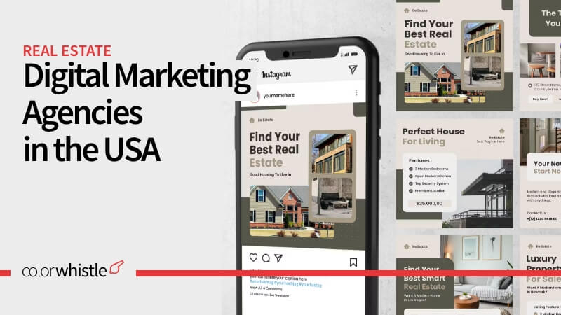
- Digital Marketing for Realtors – What to Expect from Digital Agencies?
- Real Estate Digital Marketing Case Studies That Every Realtor Must Read
- Best WordPress Real Estate IDX Plugins Compared
- Top Real Estate Website Design Ideas and Examples
- Best Real Estate WordPress Themes Compared