

All-Purpose Font Combinations / Modern Font Pairing For Your Website

Powered by an expert content team, this blog blends SEO precision with compelling storytelling. Every insight is supported by data-driven research, ensuring content that ranks, engages, and drives conversions.
Our authors are proven experts in their fields, writing on topics where they have demonstrated expertise. Every piece of content undergoes peer review and validation by industry professionals.
AI Summary
A Quick Summary of All-Purpose Font Combinations for Websites
This serves as a practical guide for web designers seeking professional font pairings. The key insight: combining fonts with visual contrast enhances readability and brand identity. The blog presents ten effective modern font combinations, from Aller + Lato to Rockwell + Lora, explaining their distinct styles and uses. It emphasizes using web-safe fonts like Google Fonts to ensure clarity and compatibility. Readers learn how thoughtful font choices impact content perception and build cohesive brand voices, enabling them to create attractive, readable websites without costly custom fonts. Next steps include experimenting with suggested pairs and exploring additional design resources.
Even though there are many fast food chains that sell pizzas, each one has something different to offer – unique crusts, signature sauces, or creative topping combinations. Just like those culinary innovations, social media graphic design isn’t a one-size-fits-all recipe.
They experiment with ingredients and techniques to create flavors that attract and satisfy customers.
The same principle applies to font combinations.
Fonts need enough visual contrast to work well together and create a balanced, readable design.
If it is a major website redesign or just creating an infographic, you need font combinations that look professional and don’t distract from your content.
10 Best Font Combinations / Font Pairing For Your Website
You don’t have to spend money towards buying expensively customized font combinations. Take a look at this modern font pairing list to provide reader-friendly text that exudes professionalism.
- Aller + Lato
- Bebas Neue + Square
- Roboto Condensed + Roboto
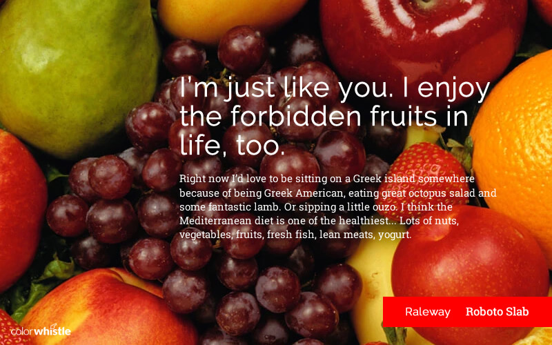
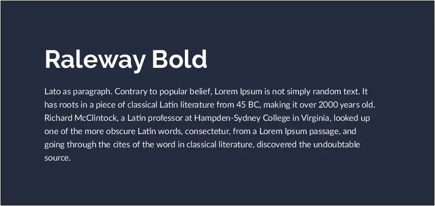
- Raleway + Roboto Slab
- Nova + Georgia
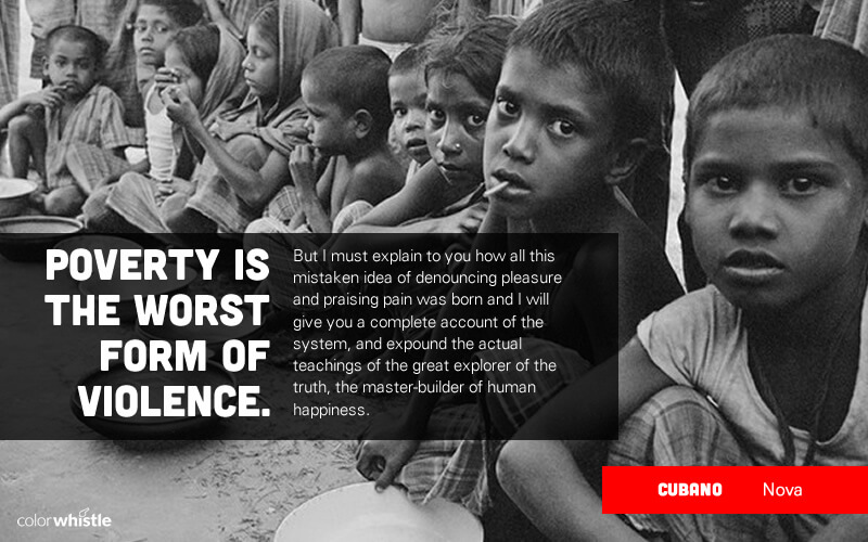
- Cubano + Nova
- Helvetica + Garamond
- Century Gothic + PT Serif
- Trajan Pro + Minion Pro
- Rockwell + Lora
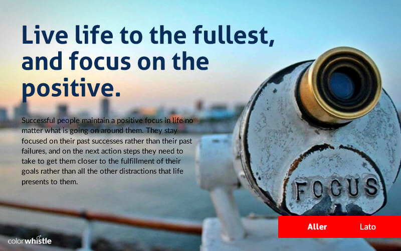
1. Aller + Lato
Aller is an excellent design that satisfies a wide range of uses from wedding invitation to corporate mass-communication. Lato is friendly, professional, and works well with heading display as well as body copy of the content.
Together they make a combination that is fun and easy to read.
2. Bebas Neue + Square
Bebas Neue is stylish and graceful with a clean line which makes it apt for web, print, and art. Square font has a good kern and blends well as a paragraph text as well as in titles.
Together they are a perfect match to create luxurious and minimalistic text
The Importance of Typographic Anatomy
Understanding type anatomy isn’t just for enthusiasts—it’s a practical skill for designers. Knowing elements like ascenders, descenders, serifs, counters, and stems helps you pick fonts that work well together.
- Match fonts with similar x-heights or stroke contrasts for harmony
- Blend serif and sans serif fonts with shared features for a polished look
- Spot readability or spacing issues early
A grasp of these basics lets you experiment confidently with bold font choices while keeping your designs clear and stylish.
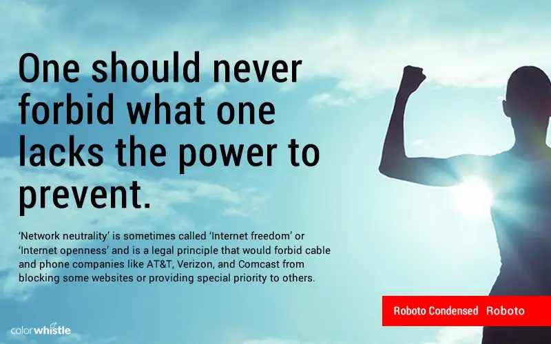
3. Roboto Condensed + Roboto
Roboto is versatile with a broad range of font weights and there are no limitations to which this font can be used for. They are modern yet geometric which makes them awesome for both form and function.
4. Raleway + Roboto Slab
Raleway has a clean and minimalistic style that works well for simple, conventional layouts. Roboto Slab is dual in nature and the font has friendly curves that give a natural reading rhythm.
Both the fonts make an amazing match of clean and refined typography.
5. Nova + Georgia
Nova font does an awesome job of showing paragraph text in a readable manner even if the font size is small. Georgia takes the complexity off and makes the text look comfortable and attractive on screen.
On the whole Nova and Georgia are becoming a classic combination on the web.
How to Build Font Hierarchy with Weights, Styles, and Sizes?
Font hierarchy guides the eye and highlights what matters. Use:
- Size: Large for headings, smaller for details
- Weight: Bold for emphasis, light for support
- Style: Italics or small caps for subtle separation
- Color: Contrasts to make key text pop
- Spacing: Whitespace and alignment to group content
Hierarchy rules are flexible—experiment until your design feels balanced.
6. Cubano + Nova
Cubano has soft and heavy strokes with curved corners giving it a friendly look. Plus, Nova is a font that people can connect easily. So the two of them work amazingly together.
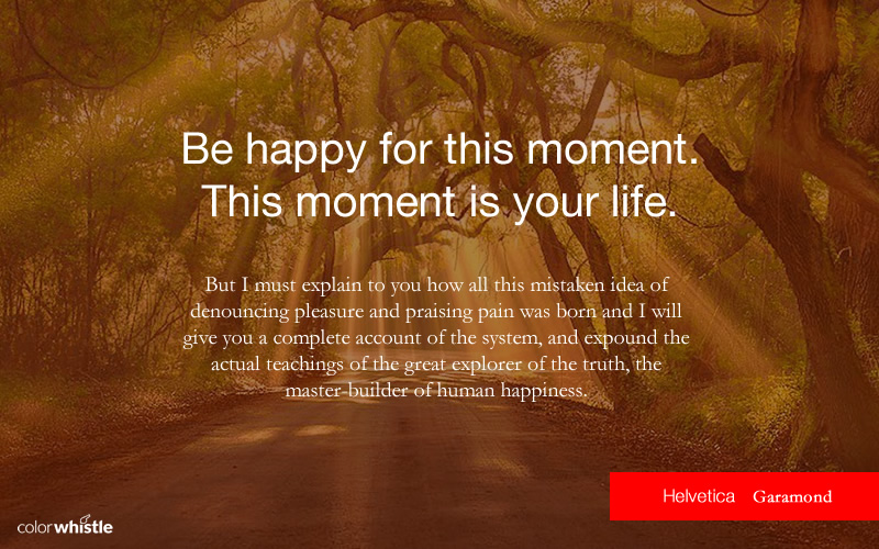
7. Helvetica + Garamond
Helvetica is a realistic design that has become one of the most well-known and widely used typefaces in the world. And Garamond gives an elegant and professional appearance to the text.
This pair is suitable for projects that require a classic and neutral typographic tone.
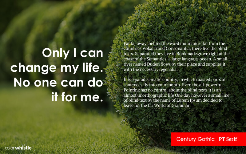
8. Century Gothic + PT Serif
PT Serif is majorly used as a paragraph text because of its style. Same way Century Gothic blends well with PT Serif for clean layouts, especially in headings and short text blocks. When you choose this combination, you can’t go wrong.
The Basics of Choosing Great Fonts for Your Projects
Selecting fonts for logos, presentations, infographics, or invitations comes down to a few timeless principles. Good typography balances style, function, and readability.
Keep in mind:
- Readability first: Body text should be clear and easy to scan.
- Visual hierarchy: Use font sizes or weights to guide readers through headings, subheadings, and body copy.
- Pair contrasts: Bold headers with simple body fonts (e.g., sans-serif + serif) create balance.
- Stay consistent: Limit to 2–3 fonts per project for a cohesive look.
- Match the tone: Choose fonts that reflect the mood. Classic for formal, playful for casual.
These basics will help you create font combinations that are both clear and visually appealing.
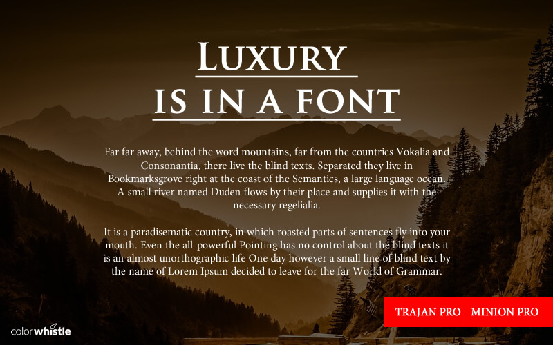
9. Trajan Pro + Minion Pro
Trajan Pro is an elegant display typeface best suited for headings, posters, and editorial designs. Minion Pro is classical and beautiful with a highly readable design type.
These two typefaces complement each other wonderfully and will grab your attention.
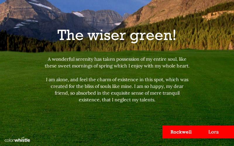
10. Rockwell + Lora
Rockwell is appealing with an eminently usable type of style. Pro has modern characteristics well suited for web and print.
Both of them have a certain style where they just seem to balance each other perfectly.
Additional Must-try Combinations

Google font combinations
When it comes to fonts, a web designer or developer always choose the ones that are web safe. These ‘web-friendly fonts’ will not pixelate or blur when viewed, which can happen in traditional print fonts. So the choice was always limited, and they were forced to use limited font combinations on the website.
Things have changed now. There is a large selection of modern web fonts that are safe for the web. Out of the many font libraries, we suggest you look into Google fonts. It comes with over 500+ font combinations with plenty of great perks and features.
The video below explains how to find Google font combinations using https://fonts.google.com/
Why Should You Use Font Combinations?
The choice of fonts has a huge impact on how readers understand a particular content.
Let us consider this poster below, which one do you think would convey more authority?
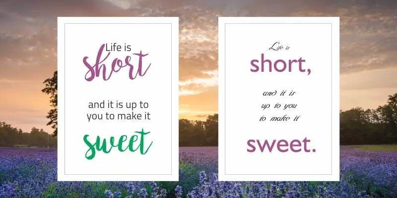
Obviously the first one.
The paring of fonts is tricky and finding fonts that actually work in this web-environment can be difficult.
When you look separately, the typefaces will be gorgeous. But when you pair them, they will look hideous, like mixing ice cream and pickle into a blender.
There’s no way to measure font options available for website designers. Almost every day, there are new typefaces created. But, all of them are not right for you no matter how beautiful they are.
When it comes to selecting the perfect font, you must consider some major aspects such as compatibility, load time, and design purpose.
Until recently, the choice of fonts was limited to a small group that were web safe. This has now changed as there is a large selection of web safe fonts available.
How Font Choices Shape Your Brand Identity
Fonts are more than just letters on a page. They’re the voice your brand speaks in. The right combination of typefaces does double duty: it makes your content readable and also sets the tone, mood, and personality for your brand. Whether you lean towards timeless serifs like Garamond or opt for something crisp and modern like Helvetica, your selection instantly signals who you are to your audience.
Pairing fonts thoughtfully helps build a cohesive look that guides how your message is received. For example, mixing a bold headline font like Bebas Neue with a friendly body text like Georgia can create an inviting yet authoritative impression. When done well, your font choices provide visual clarity and make it easier for readers to absorb and remember your content.
By blending these visual elements, you create a brand language that makes a lasting impression. In other words, every font pairing is a building block for your brand’s identity. So take the opportunity to experiment and refine until you find a combination that both suits your personality and connects with your audience.
While you can spend thousands of dollars on a custom font design, Google Fonts, and Adobe Typekit are great alternatives for font pairings. Their library has more than 500 fonts through which you can take designs to next level without burning a hole in your budget.
I hope these font combinations will inspire you to find a perfect pair for your website.
Looking for Designing & Branding Services / Solutions?
Seize and experience the transformative impact of Design and Branding Services & Solutions with ColorWhistle.

Additionally, you may also like to read our blogs, modern logo design ideas and website redesign ideas that can add more value to your website if you are planning to revamp your current site.
Also, if you’re looking to elevate your brand’s social media presence with impactful fonts in visuals, consider seeking professional social media design services from an experienced agency like ColorWhistle.
In quest of the Perfect Design & Branding Solutions Buddy?
Be unrestricted to click the other trendy writes under this title that suits your needs the best!
- Design Effective Product Review and Ratings – A Complete Guide
- How to Communicate Effectively via Infographics
- Modern Dashboard Designs, UI Design Examples
- Best Branding Practices to Increase Your Brand Power!
- Manufacturing Product Configurators That Help You Move In Customer-Centric Direction
- Technology Outsourcing Services – Statistics & Trends


Respect to op, some fantastic information .