At times, many leads would visit your website but none of them will be qualified into sales. If that’s the case, there might be so many reasons for non-conversions, one of the reasons would be the difficulties users face to navigate within your website.
For example, let’s consider the people who move out for trips. Without the help of a tourist guide, roaming in a strange place would be frustrating. When a tourist guide accompanies travelers, they will not stagger in half the way not knowing which way to go.
This is the exact scenario when it comes to website navigation. Through easy-to-follow navigation, you can make visitors smoothly move around your website without any difficulties.
When you have arranged and categorized the pages and content of your website in an organized way, visitors find it easy to pick the right fruit they need from your plate without delays!
Based on our expertise, here, we will walk you through the contribution of website navigation for your business and the effective tips on how to improve your website navigation. By the end of the blog, you will get ideas on how to design user-friendly and SEO-friendly navigation for your website.
Why is it Important to Consider Website Navigation?
Approximately, 94% of website users demand that websites they visit should be easy to navigate. Smooth website navigation will encourage your visitors to return back to your website for exploring more content with ease.
Users develop hatred toward a website that’s without user-friendly navigation. Websites without proper navigation will frustrate your visitors and lead them to bounce off your website. To avoid this, you have to design your website with smooth and solid navigation.
How to Improve Your Website Navigation?
Today, there are plenty of websites on the Internet. You can differentiate yourself from the competitors by having a smooth navigation and providing a user-friendly experience.
Here, we have listed down some of the dos and don’ts that you need to concentrate while applying navigation to your website. Make sure that your website navigation enables users and search engines to find your content quickly and accurately.
Also Read
Do’s
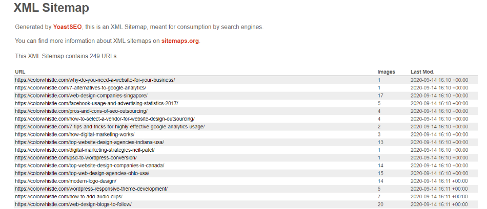
1. Having a Clear Sitemap
The basics start from having a sitemap and a clear site architecture. Whether your users are going to visit the sitemap to navigate through the website or not, having a clear sitemap is more than essential. Here is an article that talks the importance of sitemap and a clear site architecture.
2. Divide Categories
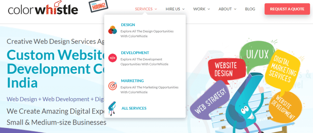
Most people don’t like to consume plain and long content. You might have multiple information for users to look into your website. Just curating all the information plainly will be cumbersome and will not deliver the right message to your visitors.
One of the best ways to build readable content is by segregating all your information under various categories. Here, you can take inspiration from our website to segregate information under relevant categories.
3. Limit the Number of Menus
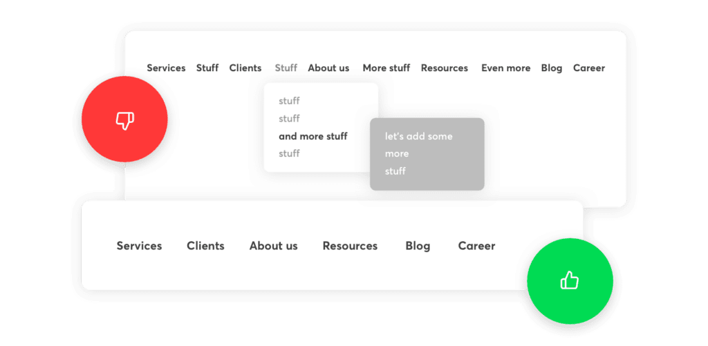
It’s good to list your menu under various categories and sub-categories. However, creating too many menu selections would be overwhelming for your website visitors. There are chances for users to lose track and abruptly leave your website.
To be on the safer end of the curve, make your menus digestible for the visitors and encourage them to explore more content.
4. Create Hyper-Links
When it comes to website navigation, giving a breathable space to your content play a vital role. With the usage of hyper-links, you will be able to groom your content instead of heaping it all together on the same page. Moreover, hyperlinks will boost the engagement of your website visitors and make your visitors stay on your website exploring more content.
5. Streamline Your Navigation Bar
The navigation bar is the platform where you arrange all the information that you want to convey to your website visitors. On the other end of the curve, the navigation bar should be designed from the customer’s point of view. It would be the right move to design your navigation bar based on what your customers will look for.
6. Use Breadcrumb Navigation Trails
Through breadcrumbs, you can make users easily find the exact location as to where they are on your website. Also, Google is displaying the breadcrumb navigation path on the search results replacing the URLs of the page. Therefore, by including breadcrumbs on your website, you can improve the user experience and get more SEO benefits.
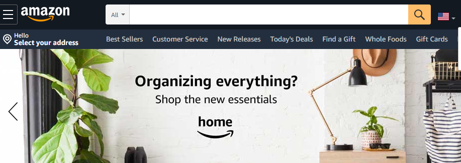
7. Make the Search Feature Easy to Find
If you want your users to unlock the content available on your website, then designing a search feature is the key. The perfect placement of the search feature will enable visitors to end his/her search and start exploring the solutions. This is how Amazon has designed a search feature on its website.
8. Ensure that the Search Box Works
The real game begins only when your search box works like suggesting relevant keywords while the user is typing, showing the previous search queries, etc. This might reduce the time consumption of the users and help visitors to find the information quickly and accurately.
9. Include Links to Home Page
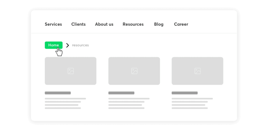
This is one of the important aspects of website navigation. Generally, people who are visiting the rest of the pages on your website would like to return to your home page. Clicking the back button on the browser would tend to be a daunting process. Therefore, try to place a button that directs users to the home page.
10. Use Clear and Concise Labels
Use simple and descriptive labels for navigation menus, buttons, and links. Avoid using jargon or technical terms that may confuse visitors. Ensure that labels are consistent throughout the website to maintain a cohesive user experience.
11. Use Visual Hierarchy
Organize navigation elements using a clear visual hierarchy, with the most important items displayed prominently. Use size, color, and typography to create a clear distinction between primary and secondary navigation elements.
Don’ts
1. Remove Misleading Navigation Texts and Titles
Visitors should have real information about what they will find if they click on a navigational link. One of the main reasons that allow users to abandon your website is misleading texts and titles. Make sure you remove all the inaccurate navigation titles and links that confuse your visitors.
Also Read
2. Avoid Using Unreadable Fonts
Unreadable fonts might confuse the visitors, so it’s better to go on with a simple and clear font style & size that your users might better understand the content.
3. Do Not Change the Navigation on Every Page
Changing the navigation across every page will annoy your website users. Try to stick on with the same navigation on all the pages. This might be easy for your visitors to easily move around every page on your website.
4. Don’t Overcrowd Navigation
Avoid overcrowding navigation menus with too many items. This can lead to decision paralysis and make it difficult for visitors to find what they’re looking for. Limit the number of navigation items and use sub-menus or secondary navigation for less important links.
5. Don’t Use Flash or Animations
Avoid incorporating Flash or animations in navigation, as they can hinder usability and slow down page loading times. Instead, opt for simple, intuitive navigation elements that work across all devices and browsers.
6. Don’t Hide Navigation
Avoid hiding navigation behind icons or requiring visitors to click or hover to access navigation. This can lead to frustration and make it difficult for visitors to find what they’re looking for.
7. Don’t Use Jargon or Technical Terms
Avoid using technical terms or jargon in navigation labels. Use simple and descriptive language that is easy for visitors to understand.
8. Don’t Forget About Accessibility
Don’t forget to ensure that navigation is accessible for visitors with disabilities. Use ARIA attributes, provide alternative text for images, and ensure that navigation can be accessed using a keyboard.
Looking for Designing & Branding Services / Solutions?
Seize and experience the transformative impact of Design and Branding Services & Solutions with ColorWhistle.
Kickstart Designing Smooth Navigation for Your Website
We hope that this blog would have helped you gain some insights on how to improve your website navigation. Of course, providing a better user experience through the website stands as a predominant factor among the business community.
Website navigation has the power to make or break your user experience. Therefore, while designing your website it’s imperative to pay more attention to the web navigation.
Moreover, website navigation has a huge impact on your SEO rankings. Search engines will find it easy to crawl and index your website when you apply smooth navigation.
If you have any more doubts regarding website navigation, feel free to reach ColorWhistle. Based on what your users expect, our skilled designers are capable of creating a solid navigation for your website. You can connect with us via phone +1 (210) 787-3600 or message at any time.
In quest of the Perfect Design & Branding Solutions Buddy?
Be unrestricted to click the other trendy writes under this title that suits your needs the best!
- Why Should Small Businesses in Canada Focus on Branding?
- COVID -19 Awareness Ad Design Ideas and Inspirations
- Combining illustrations and photographs to make boring images interesting
- PSD to WordPress – HTML Conversion, Theme Integration & Alternatives
- WordPress: Empowering Enterprise-Level Solutions with Scalability
- Design Effective Product Review and Ratings – A Complete Guide
- How to Communicate Effectively via Infographics

