Neo Brutalism in Higher Education Web UX

Anusha is a digital strategy expert with deep expertise in branding, UI/UX, and performance-focused content. She brings advanced insight into brands to scale intelligently, blending creativity with conversion-focused thinking.
Our authors are proven experts in their fields, writing on topics where they have demonstrated expertise. Every piece of content undergoes peer review and validation by industry professionals.
AI Summary
Key Highlights of Neo Brutalism in Higher Education UX
This post explores Neo Brutalism as a transformative web UX approach for higher education, emphasizing raw textures, bold typography, and asymmetrical layouts. The key insight: Neo Brutalism reflects academic authenticity and institutional transparency, breaking from traditional polished designs. It serves progressive universities seeking distinctive digital identities that foster genuine engagement and trust. The post details core design elements inspired by brutalist architecture and advises integrating Neo Brutalism within broader strategies including SEO, AI-driven personalization, and e-commerce optimization. Readers will learn to deploy this aesthetic to enhance user experience while aligning with institutional values for impactful, credible online presence.
Neo Brutalism has emerged as a powerful counter-movement to the polished, sanitized aesthetics that have dominated digital design for over a decade. This anti-design philosophy embraces raw textures, bold typography, and unapologetically harsh visual elements that challenge conventional UX principles. Within the context of Higher Education Web UX, this aesthetic approach presents unique opportunities for institutions seeking to differentiate themselves from cookie-cutter university websites.
Progressive universities and design departments are increasingly recognizing that traditional web design approaches often fail to capture the authentic spirit of academic inquiry and intellectual boldness. Neo Brutalism in Higher Education Web UX offers a compelling alternative, one that mirrors the uncompromising pursuit of truth and knowledge that defines quality educational institutions.
Authentic Engagement via UI
The movement draws inspiration from architectural brutalism of the 1950s-70s, translating concrete’s raw honesty into digital interfaces through:
- Geometric shapes and blocky layouts
- High-contrast color schemes that demand attention
- Thick borders and unrefined textures
- Asymmetrical compositions that break grid conventions
This article explores how Authentic UI design through neo brutalist aesthetics can transform higher education websites from forgettable institutional pages into memorable, engaging digital experiences that reflect the bold thinking these institutions aim to foster.
Moreover, it’s worth noting that while the neo-brutalist aesthetic can significantly enhance user engagement, it should be part of a larger digital strategy. For instance, incorporating elements like the Metaverse into the educational experience can provide immersive learning environments that further enrich user engagement.
In addition, as higher education institutions increasingly leverage IT services to enhance their online presence, understanding SEO for IT services companies becomes crucial. This long-term marketing investment option is essential for achieving compounding growth returns.
Furthermore, as these institutions explore new avenues such as remote staffing vs outsourcing, they must make informed decisions based on a comprehensive understanding of each option’s pros and cons.
Finally, implementing a robust online store for selling educational resources or merchandise could benefit from a Shopify store redesign checklist. Such a revamp could lead to increased conversions and boosted sales.
In summary, while neo brutalism can redefine higher education web UX by making it more engaging and reflective of institutional values, it should be integrated with other strategic elements such as SEO, staffing decisions, and e-commerce optimization for overall success.
Understanding Neo Brutalism in Web UX
The characteristics of Neo Brutalism come from the architectural movement of the 1950s and 60s, where concrete structures focused on function rather than form with harsh, uncompromising designs. This design philosophy has found new life in digital interfaces, challenging conventional web aesthetics with intentionally rough and unrefined elements.
The movement’s digital adaptation rejects the smooth, polished surfaces that dominate contemporary web design. Instead, raw aesthetics take center stage through intentionally rough textures, exposed structural elements, and deliberately imperfect finishes that mirror the concrete brutalist buildings that inspired the movement.
Key Visual Elements
Neo brutalist web design has several distinctive features:
- Geometric shapes dominate layouts with sharp angles and blocky forms
- Thick borders create strong visual boundaries between elements
- Raw textures simulate concrete, metal, or weathered surfaces
- Monospace fonts and industrial typography choices
- Minimal color palettes are often limited to black, white, and single accent colors
Bold typography serves as both functional hierarchy and artistic statement. Text becomes sculptural, with heavy weights and condensed letterforms that command attention while maintaining readability. Typography choices often reference industrial signage or construction site aesthetics.
High contrast ratios define the visual language, with stark black-and-white combinations punctuated by aggressive accent colors like electric yellow, harsh red, or industrial orange. These color choices reject subtle gradients in favor of flat, uncompromising hues that create immediate visual impact.
Asymmetric layouts break traditional grid systems, creating dynamic compositions that feel deliberately unbalanced yet purposeful. Elements appear to be positioned with architectural precision rather than decorative intent, emphasizing content hierarchy through spatial relationships rather than ornamental design.
The aesthetic embraces digital imperfection, pixelated edges, aliased fonts, and deliberately crude interface elements that celebrate the medium’s technical constraints rather than hiding them behind polished veneers.
Incorporating these design principles can significantly enhance user experience across various sectors. For instance:
In the automotive industry, embracing these latest UI/UX trends can lead to improved website performance and user engagement.
Fashion brands can leverage such strategies for their YouTube lookbook videos, utilizing visual storytelling for lasting engagement and sales.
Furthermore, understanding the importance of API integration is crucial in modern web design and development. A comprehensive API development guide can provide valuable insights into creating high-quality APIs that enhance website functionality.
Additionally, it’s essential to dispel common misconceptions surrounding web development. Our article on website design development myths provides an eye-opener by debunking prevalent myths that often mislead businesses during their online transition.
Lastly, if you’re encountering issues with WordPress during your journey into neo-brutalism web design or any other aspect of your website development process, our resource on common WordPress problems solved.
Core Principles of Neo Brutalism Applied to Higher Education Websites
Education website design undergoes a significant transformation when institutions embrace the raw aesthetic principles that define neo-brutalist digital experiences. Universities seeking authentic connections with their audiences can leverage these distinctive design elements to create memorable and impactful web presences.
Applying Raw and Unrefined Textures to Evoke Authenticity
Raw textures serve as powerful visual metaphors for institutional transparency and academic rigor. Design departments can implement concrete-inspired backgrounds, weathered paper textures, or grainy photographic overlays to communicate the unpolished reality of academic pursuit. These textural elements work particularly well in:
Program showcase sections where authenticity matters most
Student testimonial areas require a genuine emotional connection
Research presentation pages emphasizing real-world impact
Faculty profile sections highlighting academic credentials
The deliberate imperfection of these textures signals to prospective students and stakeholders that the institution values substance over superficial polish.
Utilizing Bold Typography to Emphasize Key Messaging and Hierarchy
Bold typography becomes the voice of institutional authority in neo-brutalist education websites. Thick, sans-serif typefaces like Helvetica Bold, Futura Heavy, or custom institutional fonts create unmistakable visual hierarchy. Progressive universities employ oversized headings that dominate screen real estate, ensuring critical information, admissions deadlines, program highlights, or research breakthroughs command immediate attention.
Typography weight variations guide users through complex academic information structures, making dense content more digestible while maintaining the aesthetic’s characteristic boldness.
Designing Asymmetric Layouts for Dynamic User Experiences
Asymmetric layouts challenge traditional academic web conventions by creating visually engaging, non-linear navigation paths. These layouts mirror the dynamic nature of modern higher education, where interdisciplinary programs and innovative research defy conventional categorization.
Design departments can implement:
- Offset content blocks that break grid monotony
- Diagonal text arrangements emphasizing key statistics
- Irregular image placements showcasing campus diversity
- Staggered navigation elements encouraging exploration
In addition to these design principles, incorporating user-generated content in video marketing can further enhance engagement on education websites. This strategy not only provides authentic insights but also fosters a sense of community among prospective students and current alumni.
Moreover, with advancements in technology such as Google AI, educational institutions can now offer smarter assistance and personalized interactions on their websites. This could significantly improve user experience and engagement.
To drive transformative growth in the education sector, it’s crucial for institutions to adopt effective education digital marketing strategies. These strategies can help in reaching a wider audience and attracting more students.
Furthermore, leveraging AI automation for smarter customer management can streamline administrative processes within educational institutions, allowing them to focus more on providing quality education.
Lastly, exploring innovative education ads design ideas can help institutions in creating compelling advertisements that resonate with their target audience.
Emotional Impact: Conveying Authenticity and No-Frills Credibility Through Neo Brutalist Design
Emotional design in higher education websites goes beyond just looking good, it builds trust between institutions and their audiences. Neo brutalist aesthetics are powerful tools for expressing institutional values through intentional design decisions that prioritize substance over superficial polish.
The raw, uncompromising nature of neo-brutalist elements creates immediate psychological associations with honesty and directness. When universities use bold color contrasts, visible structural elements, and rough textures, they show a commitment to transparency in UI that resonates with students seeking genuine educational experiences. This design philosophy rejects the shiny, corporate look that can feel impersonal or fake.
Building Trust Through Visual Honesty
Neo brutalist design choices communicate authenticity through several key mechanisms:
- Exposed functionality – Visible navigation structures and clear content hierarchies eliminate hidden agendas
- Unpolished textures – Concrete-inspired backgrounds and rough edges suggest institutional confidence rather than marketing veneer
- Direct typography – Bold, sans-serif fonts deliver information without decorative distractions
- Minimal color palettes – Limited color schemes focus attention on content rather than aesthetic flourishes
The Psychology of No-Frills Credibility
Students and faculty increasingly value institutions that demonstrate authentic engagement through their digital presence. Neo brutalist websites create credibility by appearing unafraid to show their true character. The aesthetic suggests that resources are invested in education rather than expensive web design, aligning with academic values of intellectual rigor over commercial appeal.
This approach particularly resonates with design departments and progressive universities whose audiences appreciate bold, unconventional choices. The stark visual language communicates that the institution prioritizes meaningful content delivery over conventional web design trends, establishing a foundation for genuine user relationships built on shared values rather than surface-level attraction.
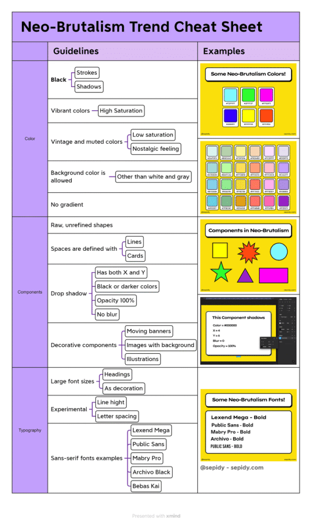
Neo-Brutalism trend cheat sheet – By https://medium.com/@sepidy
UX Trade-offs: Balancing Shock Value with Usability and Accessibility in Neo Brutalist Higher Ed Websites
The bold and eye-catching style of neo brutalism in higher education web design comes with its own set of UX challenges that need careful thought. While these striking designs grab attention and convey confidence, they can unintentionally make it harder for users to interact and understand.
Navigation and Interaction Challenges
Big shapes and unusual layouts often hide traditional navigation patterns. Students looking for course information or faculty contact details may have a tough time when familiar UI elements are replaced with abstract shapes and unexpected button placements. The struggle between usability and shock value becomes especially clear when:
Thick borders and large elements take up important space on the screen
Uneven layouts confuse users’ understanding of how information is organized
Unusual button designs don’t clearly show their interactive nature
Accessibility Considerations in Raw Aesthetics
Neo brutalist designs often use high contrast colors that, while visually impressive, can create accessibility issues. The movement’s signature style of pure blacks, whites, and bright colors may cause visual discomfort for users with certain conditions. Important accessibility factors include:
- Text readability against textured or heavily contrasted backgrounds
- Color-only information that leaves out users with color vision deficiencies
- Focus indicators that remain visible within bold design frameworks
Preserving Functionality Within Bold Design
Educational institutions must ensure that their neo brutalist interfaces serve their primary function: making it easy to access academic resources and services. This means finding strategic compromises where shock value gives way to user needs. Successful implementations maintain clear visual hierarchies through typography weight and spacing instead of relying solely on color or texture changes.
The key is to be selective, using neo brutalist elements as accent features while keeping traditional usability patterns intact for critical user tasks like course registration, library access, and student services.
However, it’s not just higher education websites that face these challenges. Similar UX challenges are also common in the SaaS industry. The need to balance bold design choices with functional usability is a concern shared across different sectors.
Moreover, understanding the market potential is crucial for success, especially for SaaS companies. This is where exploring the [Total Addressable Market (TAM)]can provide valuable insights into maximizing growth potential and impressing investors.
Case Studies of Higher Education Websites Successfully Adopting Neo Brutalist Aesthetics
Several forward-thinking institutions have embraced neo brutalist websites as a means to differentiate themselves from conventional academic web presence. These higher education web design examples demonstrate how raw aesthetics can effectively communicate institutional values while maintaining functional user experiences.
Yale School of Art
The Yale School of Art website stands as a pioneering example of neo-brutalism in academic contexts. The site features:
Deliberately crude HTML styling that reflects the school’s experimental approach to art education
Unpolished typography mixed with student-generated content
Intentional visual chaos that mirrors the creative process itself
This approach successfully communicates the institution’s commitment to artistic risk-taking and challenges traditional expectations of polished university websites.
The New School
The New School’s digital presence incorporates brutalist elements through:
- Bold geometric shapes overlaying photography
- High-contrast color schemes in black, white, and accent colors
- Asymmetrical grid systems that break conventional layout patterns
The design effectively reinforces the institution’s progressive educational philosophy and attracts students seeking non-traditional academic experiences.
Design Department Microsites
Many progressive design programs have adopted brutalist aesthetics for specific departmental websites:
- Raw concrete textures as background elements
- Chunky, pixelated fonts for headlines and navigation
- Deliberately broken grid systems that showcase creative thinking
Measuring Design Effectiveness
These implementations demonstrate measurable success in fostering authentic engagement:
- Increased time on site among prospective students in creative fields
- Higher social media sharing rates due to a distinctive visual identity
- Enhanced brand recognition within competitive academic markets
The authenticity conveyed through these bold design choices resonates particularly well with younger demographics who value transparency and creative expression over traditional institutional polish.
Leveraging Professional Help for Website Design
To achieve such unique designs, many institutions turn to professional help. For instance, top website design agencies in Indiana offer creative web solutions that can elevate an institution’s online presence by incorporating elements of neo brutalism effectively.
Integrating Advanced Technologies
Institutions also leverage advanced technologies like React.js for their website development needs. By hiring React JS developers, they can utilize the flexibility of this framework to create resilient and business-specific solutions that complement their unique design aesthetics.
Marketing Automation in Education
Moreover, adopting strategies such as marketing automation can revolutionize educational marketing, improving student engagement and boosting enrollment. Such AI-driven strategies are becoming essential in today’s competitive academic landscape.
Integration with Modern CMS and Responsive/Mobile Frameworks for Neo Brutalist Higher Ed Websites
CMS compatibility presents unique challenges when implementing neo brutalist designs within university systems. Most higher education institutions rely on established platforms like WordPress, Drupal, or custom-built systems that prioritize content management efficiency over radical design flexibility.
Technical Implementation Challenges
Universities face specific hurdles when adapting their existing CMS infrastructure to support brutalist aesthetics:
Theme limitations in popular CMS platforms often restrict the raw, unpolished visual elements central to neo brutalism
Plugin conflicts can arise when implementing custom CSS for thick borders, asymmetric layouts, and unconventional typography
Content editor constraints may prevent non-technical staff from maintaining the distinctive visual hierarchy that brutalist designs require
Responsive Web Design Adaptations
Neo Brutalism in Higher Education Web UX demands careful consideration of mobile responsiveness without compromising the movement’s core visual principles. The challenge lies in maintaining the bold, blocky aesthetic across varying screen sizes.
To tackle this issue, universities can draw valuable insights from best practices for creating mobile-friendly websites, which include:
- Scalable geometric shapes that retain their impact on smaller screens
- Flexible grid systems that accommodate asymmetric layouts while ensuring readability
- Adaptive typography that preserves the bold, statement-making character across devices
Framework Solutions
Modern CSS frameworks like Bootstrap and Foundation require significant customization to support brutalist design elements. Universities have found success using:
CSS Grid for creating unconventional, asymmetric layouts that adapt fluidly
Custom breakpoints that prioritize content hierarchy over traditional responsive patterns
Variable fonts that maintain typographic impact across device specifications
The integration process requires close collaboration between IT departments and design teams to ensure that the raw, authentic aesthetic translates effectively across all user touchpoints while maintaining institutional functionality requirements.
In addition to these strategies, it’s worth noting the potential of scalable AI-powered MVPs for seamless integration and growth within university systems. These solutions can provide efficient, future-proof options that align with the unique needs of higher education institutions.
Furthermore, as universities increasingly adopt omnichannel retail strategies similar to those employed by brands like Mizzen+Main with Shopify POS, they must ensure their digital platforms are robust enough to handle such transitions.
Lastly, as mobile applications become an integral part of the user experience in higher education, it’s crucial that these apps are designed with the same neo brutalist principles in mind to maintain a consistent brand identity across all platforms.
The Future of Education Web UX: Embracing the Impact of Neo Brutalism on Authentic User Engagement
The future of education web UX stands at a crossroads where institutional tradition meets digital innovation. Neo brutalism offers design departments and progressive universities a powerful tool to break free from cookie-cutter templates that plague the higher education digital landscape.
Design teams within academic institutions face unique challenges, balancing administrative approval processes with the need for authentic student engagement. Neo brutalist aesthetics provide a solution that satisfies both requirements: the raw, honest approach resonates with digitally-native students while maintaining the gravitas expected from educational institutions.
Creative experimentation within institutional constraints becomes achievable through:
Selective implementation – Applying brutalist elements to specific sections like student portals or program showcases
Phased rollouts – Testing bold design choices on microsites before campus-wide adoption
Student-centered design sprints – Involving student feedback in brutalist design iterations
The impact extends beyond aesthetics. When universities embrace Neo Brutalism in Higher Education Web UX, they signal authenticity to prospective students who value transparency over polish. This design philosophy transforms institutional websites from marketing brochures into genuine representations of campus culture.
Progressive universities pioneering this approach will establish themselves as forward-thinking institutions that understand their audience. The brutalist movement in education web design represents more than visual trends, it embodies a commitment to honest, unfiltered communication with the next generation of learners.
Interestingly, this commitment to authenticity is not limited to educational institutions alone. It also resonates within the realm of travel marketing, where brands are increasingly adopting similar strategies to connect with their audience on a deeper level. For instance, exploring inspiring and creative travel marketing campaigns worldwide can provide valuable insights into how such approaches can be effectively implemented across various sectors.
FAQs (Frequently Asked Questions)
What is Neo Brutalism in Higher Education Web UX?
Neo Brutalism in Higher Education Web UX is a design approach that embraces raw aesthetics, bold typography, and asymmetric layouts to create authentic and engaging user experiences on education websites. It draws inspiration from brutalist architecture and anti-design principles to evoke honesty and transparency.
What are the key visual elements of Neo Brutalism in web design?
Key visual elements of Neo Brutalism include raw textures, geometric shapes, thick borders, bold colors, high contrast, and asymmetric or blocky layouts. These components combine to produce a striking and unrefined aesthetic that emphasizes authenticity.
How can Neo Brutalism enhance authenticity on higher education websites?
By applying raw and unrefined textures along with bold typography and straightforward UI elements, Neo Brutalist design conveys a no-frills, credible impression. This fosters authentic engagement by communicating honesty and transparency to users.
What are the UX trade-offs when using Neo Brutalist design in higher education websites?
While Neo Brutalist designs offer shock value and distinctive aesthetics, they may pose usability challenges such as readability issues or navigation difficulties. Balancing bold visuals with clear buttons and accessible text is essential to maintain usability and accessibility.
Are there examples of higher education institutions successfully using Neo Brutalist web design?
Yes, several progressive universities have adopted Neo Brutalist aesthetics in their web presence. These case studies demonstrate how such designs can effectively foster engagement and convey authenticity while standing out in the competitive education sector.
How can Neo Brutalist designs be integrated with modern CMS and responsive frameworks for education websites?
Implementing Neo Brutalist designs within popular CMS platforms requires addressing challenges related to preserving raw aesthetics while ensuring responsive behavior across devices. Solutions involve customizing themes and leveraging flexible frameworks to maintain brutalist characteristics without compromising functionality.