

Top 10 Mobile-Friendly WordPress Themes

Powered by an expert content team, this blog blends SEO precision with compelling storytelling. Every insight is supported by data-driven research, ensuring content that ranks, engages, and drives conversions.
Our authors are proven experts in their fields, writing on topics where they have demonstrated expertise. Every piece of content undergoes peer review and validation by industry professionals.
AI Summary
Key Highlights of Top Mobile-Friendly WordPress Themes
This post explores the top mobile-friendly WordPress themes essential for businesses adapting to mobile-first indexing and user expectations. The key insight: selecting a responsive, fast-loading theme improves SEO, user experience, and site performance. It reviews leading themes like Astra, Divi, Avada, and GeneratePress, highlighting features such as optimized Core Web Vitals, accessibility, and compatibility with popular page builders. Designed for website owners and developers, the article guides theme choice to boost search rankings and mobile usability. Next steps involve leveraging these themes to ensure long-term growth and seamless mobile site performance.
As mobile usage continues to dominate web traffic, having a mobile-friendly WordPress website is no longer optional. With Google’s mobile-first indexing and growing user expectations, businesses need themes that deliver speed, usability, and consistent performance across all screen sizes.
Choosing the right WordPress theme plays a crucial role in website visibility, user experience, and search engine rankings. A modern theme should focus on mobile-first design, fast loading times, accessibility, and customization flexibility. Partnering with experts who offer professional WordPress website development services helps ensure your theme selection supports long-term growth and performance.
In this article, we explore the top mobile-friendly WordPress themes that combine responsive design, performance optimization, and modern aesthetics—making them suitable for websites in 2026.
Features of Mobile-Friendly WordPress Themes
Modern mobile-friendly WordPress themes are built using a mobile-first approach that prioritizes performance, usability, and accessibility. Beyond basic responsiveness, these themes are designed to meet current SEO standards and user expectations.
Key features include:
- Mobile-first and fully responsive layouts
- Optimized Core Web Vitals (LCP, CLS, INP)
- Lightweight CSS and JavaScript for faster page loading
- Touch-friendly navigation and buttons
- Accessibility-ready design standards
- Compatibility with Gutenberg, Elementor, and modern page builders
- Regular updates and security support
Top 10 WordPress Mobile-Friendly Themes
Here are some of the top mobile-friendly WordPress themes,
- Astra
- Divi
- Avada
- Betheme
- GeneratePress
- Hestia
- Neve
- OceanWP
- Sydeny
- Zakra
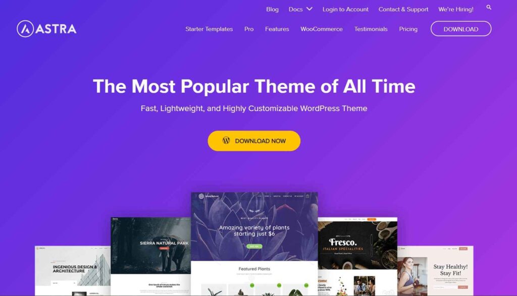
Astra
Astra is a widely used WordPress theme with more than one million active installations around the world. It is a popular choice for any niche due to its high responsiveness and sophisticated editing modules that enable users to customize their website to look stunning on mobile devices. It is also renowned for its rapid loading speed and user-friendly interface, making it a great option for beginners.
Astra offers a wide selection of premium, quality, and user-friendly Starter Templates, enabling users to quickly construct any website. Additionally, the theme is fully mobile-responsive, allowing it to look stunning on desktops, mobile devices, tablets, and other devices.
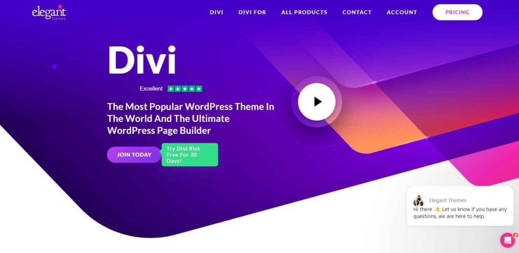
Divi
Divi is a performance-optimized WordPress theme designed for mobile-first websites. It offers flexible design controls, fast-loading layouts, and seamless compatibility with modern page builders, making it suitable for scalable business websites.
The Divi Builder provides users with full control over their website, including the ability to customize module placement, fonts, and colors, as well as toggle between various screen widths within the builder and observe how designs adapt.
Additionally, Divi offers hundreds of website packs that are designed to be mobile-friendly, allowing users to populate their entire website with their content. This eliminates the need for manual mobile optimization after installing a pack.
Also Read
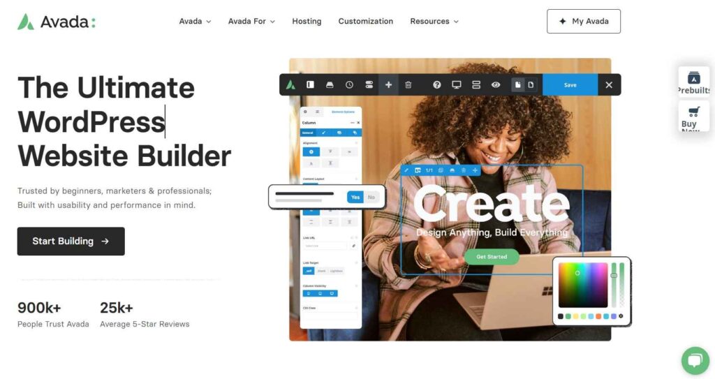
Avada
Avada is one of the most popular WordPress themes used by professionals, agencies, businesses, and creative people to create professional-looking websites on desktop and mobile. It is a mobile-friendly theme that is 100% responsive and is regularly updated to improve visual performance.
Avada’s drag-and-drop visual content editor makes it easy to design, maintain, and update your website. With Global Styling, you can quickly preview your website on different screen sizes. With more than 750,000+ satisfied Avada users, it’s one of the most versatile and highly customizable options for creating professional-looking websites that don’t require coding.
Avada offers a variety of design options and is fully responsive. Avada is a top-notch, search-engine-friendly theme that enhances your site’s ranking in search engine results and is regularly updated with the latest features and bug fixes.
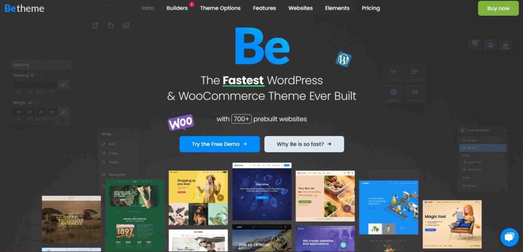
Betheme
Betheme is a premium WordPress theme with a modern design, powerful features, and a user-friendly interface. It has achieved a high level of popularity among WordPress themes on the market, with over 500,000 sales.
Fully responsive, Betheme is compatible with major drag-and-drop page builders such as Elementor. Betheme provides over 650 pre-made templates for your business, blog, portfolio, or e-commerce store. It also offers customization options for header builder, footer builder, loop builder, and popup builder.
Betheme is WooCommerce compatible and provides settings to make your website perform better in search engines and on mobile devices.
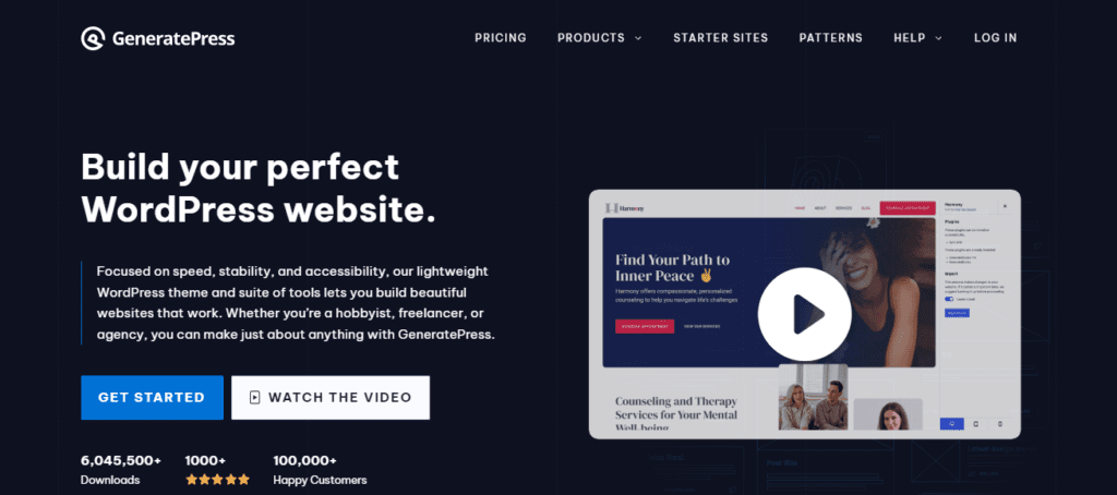
GeneratePress
If you’re looking for a quick, user-friendly, and easy-to-use WordPress theme, then look no further than GeneratePress. It’s a lightweight, SEO-optimized WordPress theme that’s built to meet WCAG standards, allowing users to build their entire website in a matter of clicks, without the need for coding.
The theme is fully responsive, and customizable, and includes a built-in Gutenberg block editor, eliminating the need for technical issues. And if you’re a developer, you’ll love the hooks and filters that come with GeneratePress, so you can easily create custom themes or plugins.
The benefits of using a GeneratePress theme include: Enhanced website performance Increased SEO potential Increased design flexibility Streamlined content creation, and Simplified development workflow.
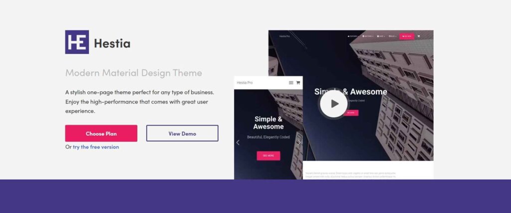
Hestia
Hestia is one of the best one-page WordPress themes that is easy to use and SEO-friendly. It has a minimalistic design that is perfect for modern online businesses and startups that emphasize ease of navigation. It looks great on mobile as well as on desktop and works with most of the major page builders.
Hestia is WooCommerce compatible and comes with pre-built versions that include everything from contact details to client testimonials and shop descriptions. All the themes are mobile-friendly, so you don’t have to create and launch your website from the ground up.
Also Read
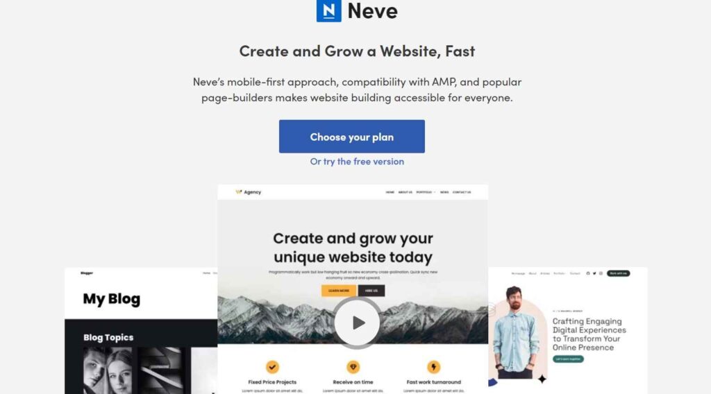
Neve
Neve is a WordPress theme optimized for Search Engine Optimization (SEO) and fully compatible with Accelerated Mobile Pages (AMP). It is designed to provide a lightweight and user-friendly experience and is compatible with popular plugins and page builders, including WooCommerce, Elementor, Brizy, Beaver Builder, Visual Composer, and SiteOrigin.
Additionally, the Block Editor is an essential component of the theme and can be purchased in either free or premium versions. Neve also offers a wide range of pre-designed templates, compatibility with popular WooCommerce plugins, RTL and translation, and excellent customer support.
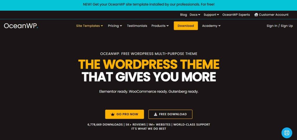
OceanWP
OceanWP is a modern, business-oriented, responsive WordPress theme that is open-source and free to use. It provides a modern, professional look and feel, with a fast-loading, lightweight, highly customizable template, optimized for SEO. OceanWP is translation-ready, which means that you can easily translate your website into any language.
It is suitable for a variety of websites, from blogs to businesses, portfolios to WooCommerce storefronts, and is pre-built with pre-made templates and widgets. Additionally, OceanWP is compatible with a variety of page builders and optimized for mobile devices, making it an ideal choice for businesses and beginners alike.
Key features of OceanWP include SEO-friendly design, WooCommerce integration, and multilingual support, as well as regular updates.
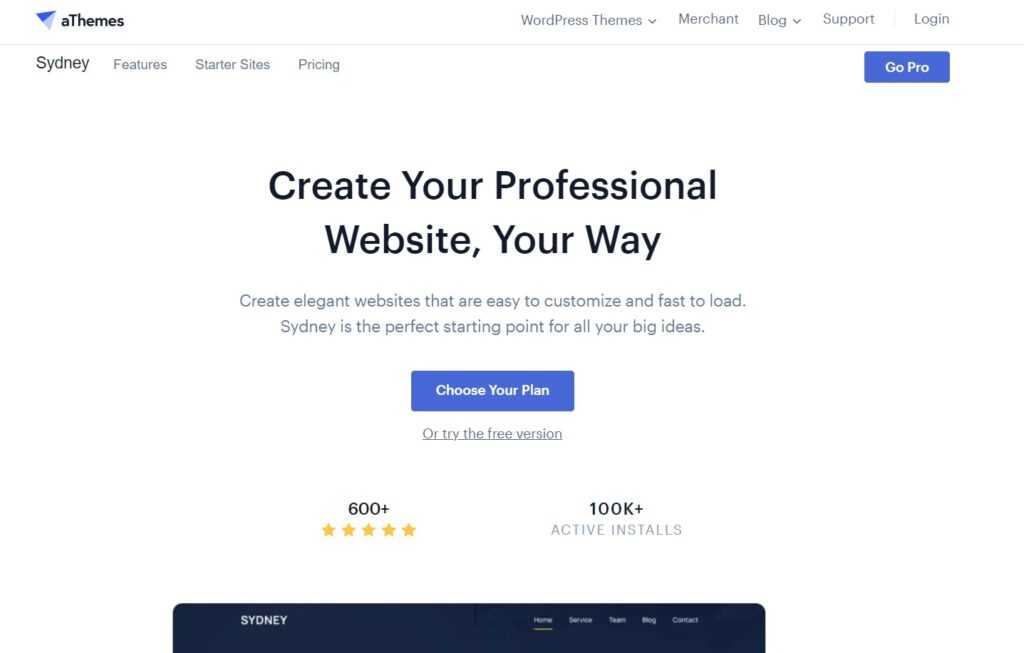
Sydney
Sydney is one of the best multi-purpose themes by Athemes. It’s one of the top-rated WordPress themes. It has a wide range of demo websites and is compatible with many plugins, including WooCommerce. It also has a drag-and-drop page builder that lets you customize your website without coding.
You can choose from a variety of customization options, including full-color control, layout control, and even the ability to upload your logo. Elementor recommended it for its elegant design and performance optimized for mobile devices.
Sydney Pro is a WordPress theme with three well-made starter templates and 15 designs. It provides a user-friendly scroll-to-the-top button for enhanced user experience and it’s compatible with the new Google Ampere technology that makes your website load faster on mobile devices. This makes Sydney Pro a great choice for anyone who wants to improve the performance of their website.
Also Read
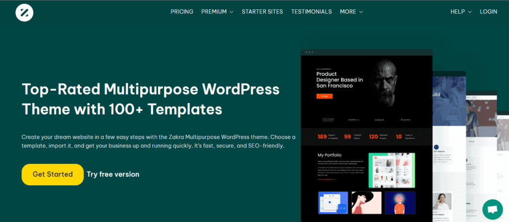
Zakra
Zakra is a free, open-source, mobile-friendly WordPress theme that provides users with the ability to create any type of website with minimal effort. It is characterized by its contrast-rich, gray background, ten free demo sites, and all the page elements necessary for a responsive design.
Furthermore, it offers a wide range of features such as pre-designing over 80 demo sites, a responsive design optimized for speed, compatibility with a range of WordPress plugins, lightweight loading, user-friendly design, and SEO optimization.
All of these features make Zakra an ideal choice for beginners, as it is easy to use, highly customizable, and optimized for performance.
How Mobile-Friendly WordPress Themes Impact SEO
Mobile-friendly WordPress themes play a significant role in search engine optimization. With mobile-first indexing, Google primarily evaluates the mobile version of a website for ranking and indexing. Themes that prioritize performance, stable layouts, and fast loading times contribute to better Core Web Vitals, lower bounce rates, and improved search visibility.
Wrapping Up
Delivering a seamless user experience is essential in today’s mobile-first digital landscape. A responsive and performance-optimized website is no longer a bonus, it’s a necessity for visibility, engagement, and conversions. Choosing the right WordPress theme plays a critical role in ensuring your website performs consistently across devices, browsers, and screen sizes.
While all the themes listed above are mobile-friendly and modern, Neve stands out for its lightweight structure, flexibility, and performance-focused design. That said, the best theme ultimately depends on your business goals, content strategy, and customization needs. With the right theme in place, your website can remain fast, accessible, and visually appealing across all platforms.
If you are an enterprise and looking for professional guidance on WordPress website development you can contact ColorWhistle by sending us a message or call us at +1 (919) 234-5140, we’ll get back to you at the earliest.
What’s Next?
Now that you’ve had the chance to explore our blog, it’s time to take the next step and see what opportunities await!
 Furniture Customization Made Easy Empowering ...


As a digital marketer, I find the blog on mobile-friendly WordPress themes insightful and well-structured. It covers top themes like Astra and Divi, highlighting their responsiveness and customization features, which are essential for a great user experience. The content is helpful, but regular updates would ensure it stays relevant with evolving trends. Adding performance insights and real user feedback could provide a more practical perspective. Overall, it’s a useful guide for businesses and marketers looking to optimize their websites for mobile users.
Mobile-friendly WordPress themes are important. So, you suggest different countries. You explain flame, there are many things.
Thank you, for saying it so beautifully.