Project Details
Industry: Education
Tools Used: ACF Builder
Region: Coimbatore, Tamil Nadu
The Team
Project Manager: Rajeev, Thinakar
Developers: Dinesh, Jeeva
Project Duration: 12 Weeks
Introduction
In our collaboration with SKCET, a prominent player in the education sector, we faced a significant challenge: their website was underperforming. As a renowned engineering college known for its excellence, its online presence needed improvement. The website had not been updated in a while, resulting in a slow and complex site filled with more than 1500 unoptimized PDFs and images.
Understanding the importance of digital transformation for a premier educational institution, our team took action. By overcoming technical obstacles, we successfully enhanced the online space, aligning it seamlessly with the institution’s commitment to cutting-edge education and technological advancements. This case study reveals how we addressed these specific issues, revitalizing their website to make it more efficient and impactful. By revamping this college website, we skillfully combined innovation and functionality to create a seamless user experience.
Client’s Requirements
The client’s top priority was improving the performance and loading speed of their website. The site receives a large amount of traffic, especially during important events like result announcements. However, the current server infrastructure struggles to handle the increased load. The client was eager to resolve these issues to provide a smooth and responsive user experience and avoid downtime during peak traffic periods.
The main objective was to optimize the website’s performance to accommodate the high number of users, especially during critical moments, and to address server-related challenges that lead to downtime. This initiative marked a significant step towards the college website revamp, redevelopment, and redesign, aligning the platform with modern standards and enhancing overall performance.
Challenges Faced
The website faced multiple critical challenges that required immediate attention. Firstly, around 1500 PDFs were cluttering the site, which were not properly organized or aligned. This confused users trying to access information. Furthermore, the site’s images were not optimized, leading to slow page loading. The overall loading speed was a major problem, negatively affecting the user experience.
The website had too much content, which made it hard for visitors to find what they wanted. Additionally, the site was not organized well and didn’t have a clear structure, which made it confusing to navigate. Hence, the requirement for a thorough college website revamp and redevelopment became apparent to enhance user satisfaction by transforming and optimizing the platform.
What Did We Do?
UI Revamp
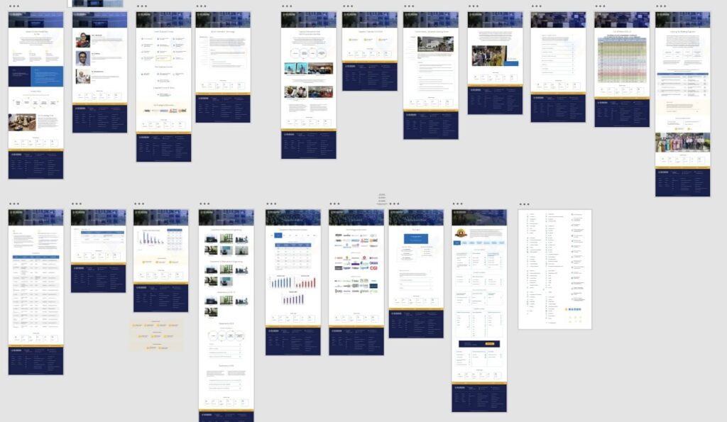
In the initial steps of revamping the college website, we worked together with the client in a collaborative brainstorming session to identify their design expectations. We aimed to gather valuable input on what to keep and eliminate from the previous website, resulting in a well-thought-out approach to the user interface.
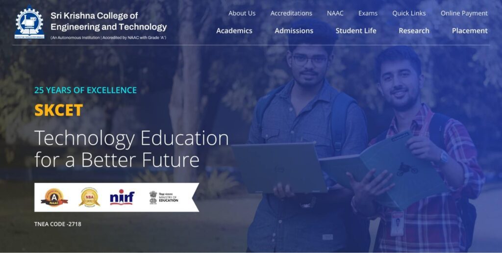
We prioritized selecting a layout that enables parents and students to easily navigate and quickly identify the information they need. In addition, we explored techniques to skillfully display the university’s abundant heritage, giving special attention to its aesthetic aspects. Through this interactive process, we were able to revamp the college website’s UI and create a design that beautifully represents the college’s legacy while also prioritizing user-centric functionality.
Optimize the Images
In our recent efforts to revamp the college website, our primary focus was on enhancing the user experience by addressing performance issues. One crucial aspect that needed to be addressed was the large number of images spread across the site, which significantly impacted loading speed.
Understanding the importance of the issue, our proficient development team acted swiftly. Through the utilization of online tools, we executed a meticulous image optimization strategy. This enabled us to strike a balance between visual appeal and a substantial reduction in file sizes.
The outcome was immediate and profound. The optimization of these images resulted in a significant enhancement in the site’s loading speed, delivering a seamless browsing experience to visitors. By utilizing tools such as TinyPNG, we managed to enhance the website’s performance without compromising its visual appeal.
Optimize the Database
During the extensive revamp of our college website, we encountered an issue that was causing inconvenience for users – an excessive number of 1500 disorganized PDFs spread throughout the platform. To solve this issue, our skilled development team started a thorough revamp.
Our main goal was to enhance the user experience by providing seamless access to important information. To achieve this, we took on the task of organizing the PDFs with precision, aligning them in a way that allows for intuitive navigation. This thorough restructuring not only improved the overall user interface but also made it easier to retrieve crucial documents.
Additionally, we acknowledged the importance of organizing the database. We promptly identified and eliminated unwanted and outdated PDFs, making the digital repository more streamlined. This not only improved storage capacity but also enhanced the efficiency and responsiveness of the website.
Technology Stack
We utilized a range of powerful tools to enhance functionality and the user experience while revamping the college website. Our collection of carefully chosen tools comprised essential resources that played crucial roles in achieving our mission.
Essential Tools Driving Our Website Revamp
Advanced Custom Fields PRO: With the ability to customize the content structure of the website, we can ensure a personalized and effortless user experience.
All-in-One Security (AIOS): By strengthening our security measures, AIOS ensured a secure online environment, safeguarding the website from potential threats.
Presto Player: Making videos smoother and more engaging, Presto Player facilitates smooth and engaging video playback, enhancing visual content presentation.
Redirection: By managing URL redirects and streamlining user navigation, redirection played a vital role in optimizing the website’s overall structure.
Tablepress: With TablePress, we can create tables that are both dynamic and responsive, elevating the way we showcase data and enhancing the overall display of information.
Yoast: Yoast’s contribution to search engine optimization was significant as it helped optimize content for maximum visibility and discoverability.
Asset CleanUp Pro: Boosting website speed and efficiency, Asset CleanUp Pro minimizes unnecessary resource loading, contributing to faster load times.
Contact Form 7: Contact Form 7 simplifies communication, serving as the main way for users to interact and share feedback in a user-friendly manner.
Lightbox: We’ve added a Lightbox plugin that allows for smooth image zooming, taking the visual experience to a whole new level with dynamic and interactive image viewing.
Elevating User Engagement with Libraries
The addition of well-integrated libraries greatly enhanced our college website transformation journey. Some notable mentions include:
Slider – Tiny Slider Library: This library has completely transformed the way we present content by adding a dynamic element to our sliders. As a result, user interactions have become much smoother and more visually captivating.
Light Gallery JS – Image Gallery: The use of Light Gallery JS significantly enhanced the presentation of visual content, resulting in an immersive image gallery experience that enthralled our audience with its seamless navigation and stunning visuals.
User Experience (UX) Enhancements
Our main goal was to enhance the user experience, so we made several improvements. We optimized navigation, made pages load faster, and ensured that the website is mobile-friendly. These strategic enhancements all work together to create a website experience that is seamless and user-centric.
Content Strategy
Updating Content with Precision
We improved the client-provided content to align with the goals of the updated website. We carefully cleaned up and refined the information, making sure that it perfectly aligned with the new design and user objectives.
Strategic Removal of Unwanted Content
We carefully identified and removed unnecessary and outdated content, improving the website’s information flow and making it easier for users to navigate. This approach shows our dedication to providing a visually appealing and meaningful website experience.
Introducing Purposeful New Sections
During our website revamp, we didn’t settle for just updating the existing content. We took it up a notch by strategically incorporating new sections to elevate the user experience. These additions are thoughtfully crafted to cater to current needs and seamlessly align with the goals of the updated website. We’ve taken a step further in creating a website that not only meets current user expectations but also stays ahead of the game. These new sections not only make navigation easier but also provide valuable insights, showcasing our dedication to addressing evolving needs.
Making Servers Stronger for More Visitors
The website used to experience downtime when many users visited it while it was hosted on a Windows server. To solve this problem, we suggested and carried out an important update by switching to a Linux server. This decision guarantees that the website can handle up to 10,000 users at the same time without any performance issues. This server upgrade not only solves previous problems but also strengthens the platform for future growth and ensures uninterrupted service, even during busy periods.
Results Obtained
Sections
Practices and Changes
Results and Impact
Optimizing Images
Used TinyPNG for image optimization
Improved site loading speed and overall performance
Optimizing Database
Organized PDFs and removed unwanted ones
Streamlined databases improve user access to essential documents
Tools Used
Integrated various tools and plugins like Yoast and Contact Form 7
Enhanced functionality, improved SEO, and streamlined user interactio
User Engagement with Libraries
Integrated Slider and Light Gallery JS libraries
Enriched multimedia experience, captivated audience with dynamic content
User Experience (UX) Enhancements
Optimized navigation, improved page load times, mobile-friendly design
Enhanced overall user experience and site accessibility
Updating Content with Precision
Refined existing content, removing unnecessary information
Streamlined content for relevance and improved user understanding
Strategic Removal of Unwanted Content
Removed outdated and irrelevant content
Reduced clutter and improved information flow on the website
Introducing Purposeful New Sections
Added purposeful new sections to the website
Expanded content offerings, enriched user experience
Making Servers Stronger for More Visitors
Transitioned from Windows to Linux server
Mitigated downtime, strengthened server for scalability
Visual Before-and-After Comparisons
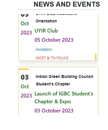
Event Section Makeover: Before and After Shots
Before
After

Quality Policy Upgrade: Before and After Visuals
Before

After
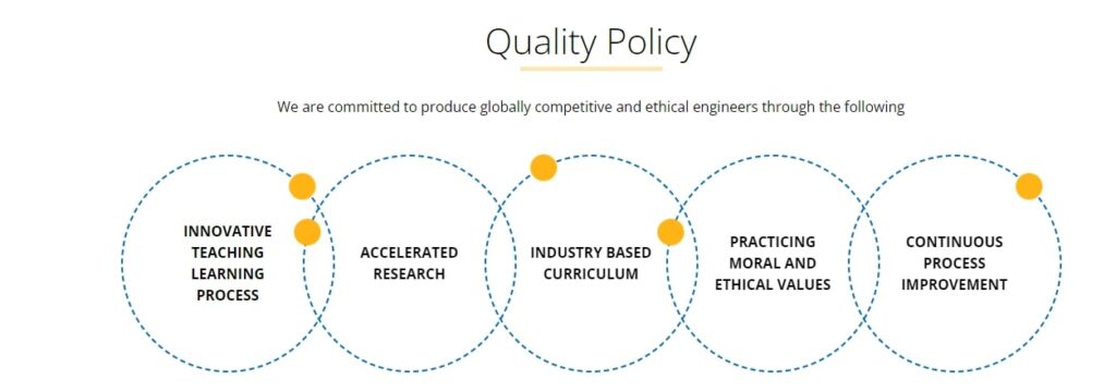
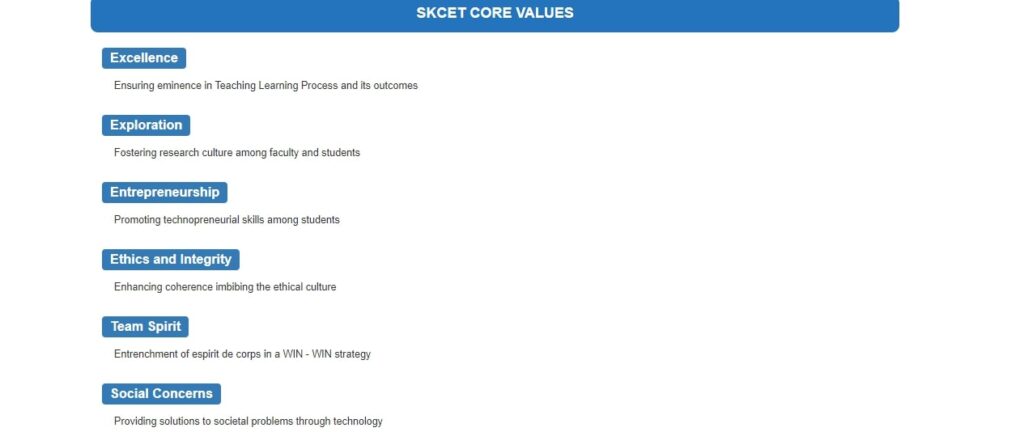
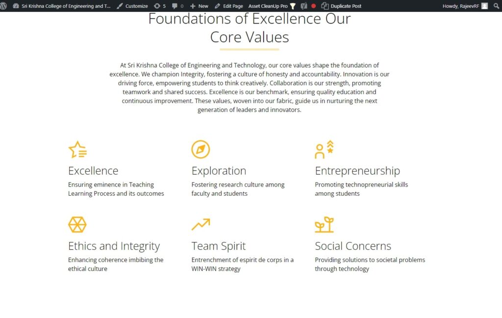
Core Values Refresh: Before and After Shots
Before
After
Departments Section: Before and After the Website Revamp
Before
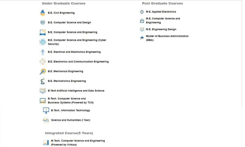
After
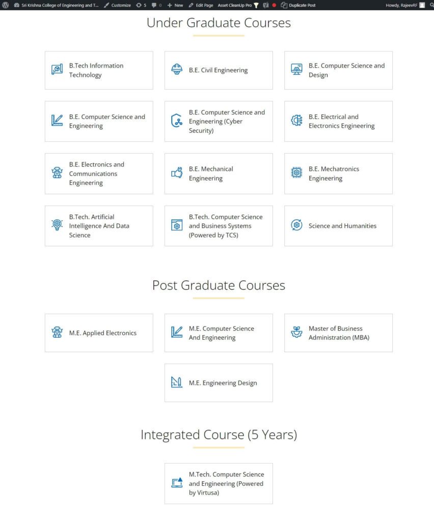
Timetable Section: Before and After the Revamp
Before

After
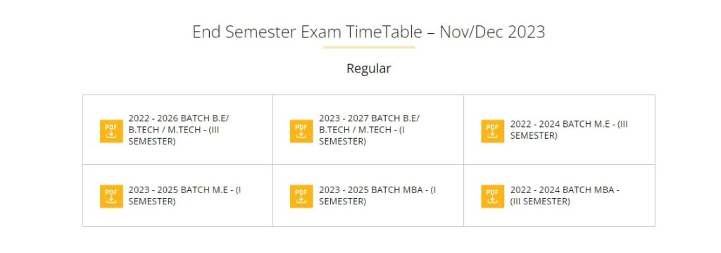
Performance Improvements
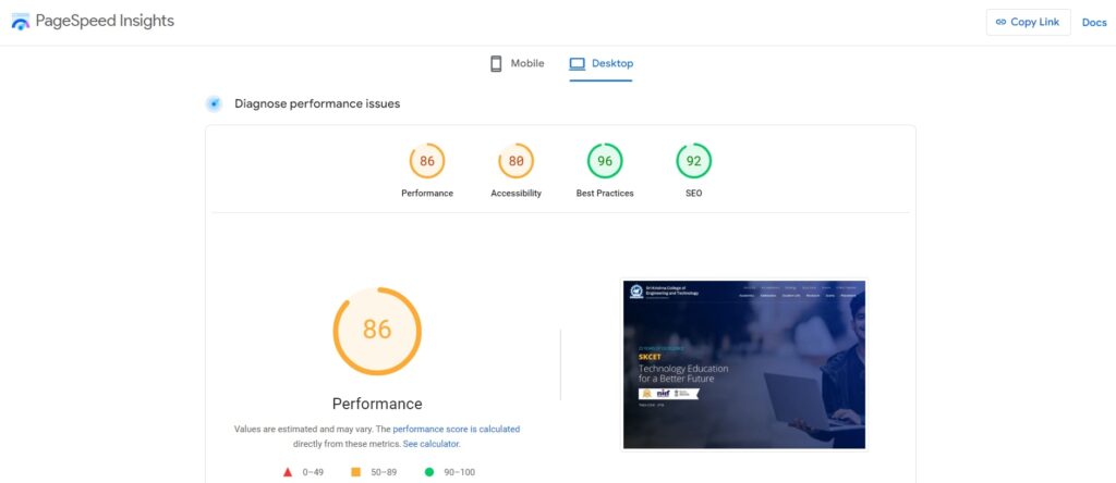
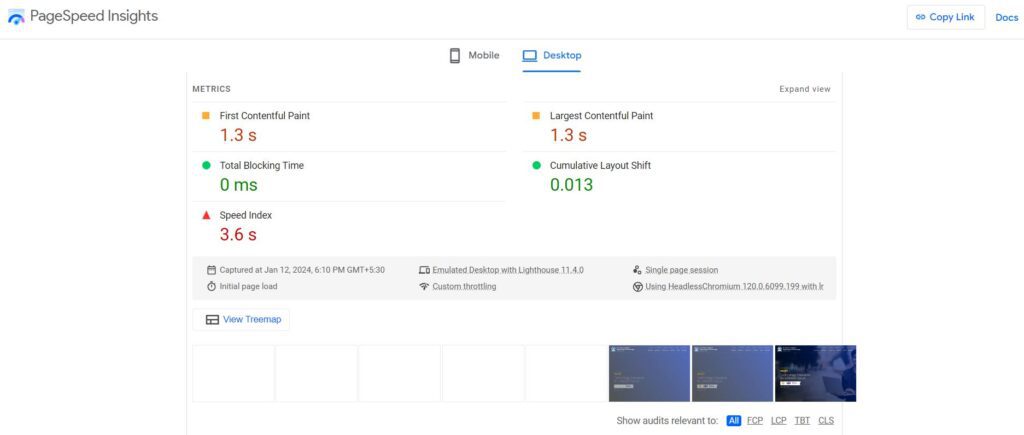
Final Take
Throughout the process of revitalizing our client’s website, each strategic decision taken was not just a mere improvement but a significant transformation. By enhancing images and databases and introducing purposeful new content sections, our comprehensive approach was focused on crafting a digital environment that exuded precision and efficiency.
The results speak for themselves – a website that has been finely tuned for optimal performance, providing users with enriched experiences, and a server that can effortlessly handle high traffic demands. These efforts have not only streamlined user interactions but have also propelled the site into a robust and scalable platform.
The success of this transformation goes beyond mere metrics; it is evident in the positive impact it has had on our client’s educational institution. The digital space now stands as a powerful asset, captivating audiences and driving success.

