AI Summary
Modern Logo Design Inspirations & Ideas for 2026
This serves as a practical guide for businesses and designers seeking impactful modern logo designs. The key insight: a modern logo must be simple, minimalistic, memorable, and brand-related to create lasting impressions. The blog analyzes iconic logos like Nike, FedEx, and Airbnb, illustrating how clever design elements influence customer perception and brand identity. It offers curated examples and expert tips to inspire logo creation or rebranding efforts. Readers will learn how to apply contemporary design techniques to enhance brand recognition, ultimately boosting customer engagement and business success. Next steps include consulting a skilled graphic designer and starting the branding process.
In 2026, creating a logo needs more than just creating a visually striking mark; it also requires flexibility, digital readiness, and important brand communication. A contemporary logo should be both eye-catching enough to make an impression and easy enough to display right on small mobile displays. Logo design is now a strategic asset that impacts reputation, usability, and recall because of new digital platforms and changing visual trends.
To help you in creating or assessing a modern logo that stands out in the current competitive marketplace, this tutorial breaks down key ideas, current trends, useful techniques, and real-world examples.
What Defines a Modern Logo in 2026
In 2026, a modern logo is defined to be:
- Simple
- Minimalistic
- Easily identifiable
- Rememberable
- Recognizable
- Related to the brand
Modern Logo Design
Your website or business logo design is what people and site visitors will remember to associate with you forever. Therefore, developing a fantastic logo is a big endeavor. Knowledge of latest design techniques is essential to the creation of a modern logo design that is unforgettable.
A logo speaks about your business, about your product, about your services. It must speak to your customer.
Something like the logos below tells you why a best logo design can make all the difference to you and your business.
If you are starting a new business or thinking of revamping your existing logo, we have put together a set of modern logo designs that we hope will inspire you in your quest for the perfect logo design for your business. Do take a few seconds to let us know via comments, which one you think is your favourite.
Best Modern Company logos
Firefox Logo
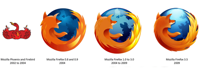
The web browser Firefox’s logo has evolved a lot through these times. Now the modern company logo is very popular for its clean and distinctive look.
Nike Logo

The ever popular, ever simple modern logo of all times is Nike. The simple swoosh is a strong representation of victory and it carried with it a very strong brand identity. Read a detailed article here about how this logo has evolved to be one of the strongest with an even stronger client base.
Volkswagen Logo
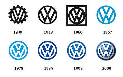
The modern logo of Volkswagen, as is seen currently, is a simple representation of the initials of the company. While “Volks” in German stands for people, “Wagen” stands for car. Originally, the company logo is said to have been designed in 1938. Read from the article about how this logo has evolved through times.
Shell Logo
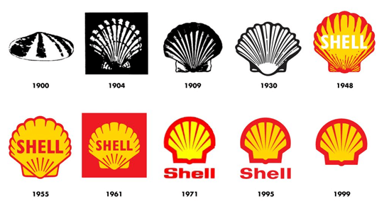
This company which was found on 28th May 1937, has a track record of elegant, modern branding over the years, which did not undergo any major change in branding but slight tweaks and modifications to suit the current trend then.
VAIO Logo
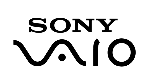
Vaio by Sony has a hidden meaning in it, which will wow / inspire any designer. The modern company logo integrates the ideas of analog and digital technology into one, using the V and A to represent an analog wave, and the I and O to represent binary from the digital world.
Baskin Robbins Logo
Baskin Robbins reworked on their logo thrice and 31 is the key there. The number of flavors they serve. Read here the interesting story of Baskin Robbins logo evolution over a period of time.
Elefont Logo
Elefont logo stands straight forward with the clever use of negative space. The logo is very clean and simple and the negative space clearly denotes the trunk of an elephant. modern company Logos like these are clear inspiration for anyone who is looking to brand their ideas.
Spartan Logo
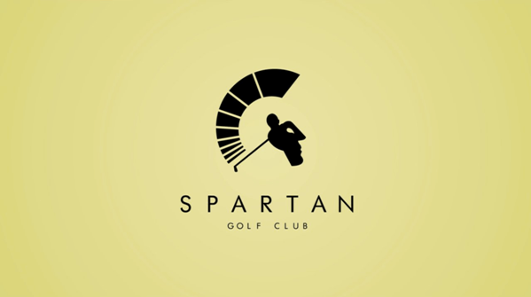
Looking head on, it appears to be a golfer who has just completed a drive, no doubt in the middle of the fairway! However, when you look at a side profile, the helmet of a Spartan warrior appears. Nice dual symbolism works well for this logo.
Fedex Logo
The most interesting fact about the FedEx logo is that it creates an optical illusion; if you observe closely between the ‘E’ and the ‘X’, you’ll notice a presence of an arrow there. The arrow represents the speedy and accurate service of the company. The arrow was formed after 200 FedEx logos were already designed and reviewed by Lindon.
Read the full article here.
LG Logo
LG is the brand that is Delightfully Smart. “Life’s Good” slogan, and futuristic modern logo are a great representation of what we stand for.
Global, Tomorrow, Energy, Humanity and Technology are the pillars that this corporation is founded on; with the capital letters L and G positioned inside a circle to center our ideals above all else, humanity. The symbol mark stands for our resolve to establish a lasting relationship with, and to achieve the highest satisfaction for our customers.
Read Here what LG themselves have to say about their brand identity
Adidas Logo
The word mark that Adidas has used since 2005 goes back to the simplicity of the three stripes and is said to represent quality and leadership, and maintains flexibility for the future. Adidas is now just one company in the Adidas Group, which also includes Reebok and TaylorMade.
Fisher Price Logo
One of the better-known lines of Fisher-Price is their Little People toys, which include various sets of buildings and vehicles with their respective “people” figures, which used to be made of wood and metal but are now made of plastic.The brand design is clear and easily remember able even by the kids.
WWF Logo
The inspiration came from Chi-Chi: a giant panda that had arrived at the London Zoo in the year 1961, when WWF was being created.
Aware of the need for a strong, recognisable symbol that would overcome all language barriers, WWF’s founders agreed that the big, furry animal with her appealing, black-patched eyes would make an excellent logo.
Read here about the rough sketches and way this modern logo evolved.
Starbucks Logo
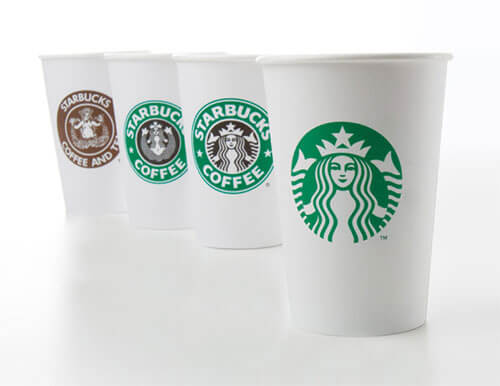
The current version of the Starbucks logo was unveiled in 2011, as part of the company’s 40th anniversary. The revised, streamlined logo received harsh criticism from design experts and popular audiences alike. The controversial “wordless” redesign removed the outer green circle that featured the “Starbucks Coffee” brand name, while enlarging the inner siren. But still this is a good modern logo with clean lines and which will always be remembered by everyone.
American Airlines Logo
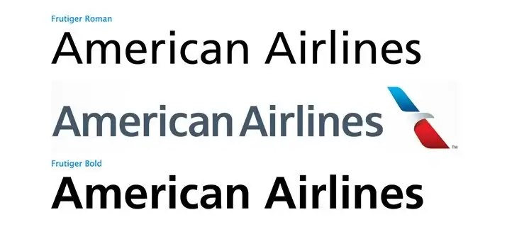
American Airlines has had the same logo for forty-five years. That’s definitely a pretty impressive stretch! They’ve decided to hang up their Helvetica though and look to not only a new typeface, but a new eagle and even a new livery design.
Read here to see the logic behind the new design and whether or not I think it’s another chapter in a long line of recent brand redesigns gone bad.
Airbnb Logo
The most popular airbnb, when came up with a logo revamp in 2014, there were a lot of likes and dislikes for the new logo. Though, a good amount of people were totally against this revamp, this logo is one of the clever modern company logos that brings together all the keywords the company is associated with.
Read from the article about this logo revamp and brand development by the DesignStudio.
List of Curated Modern Logo Design
There are quite a few more, which are really attractive and have used clean lines, negative spaces, overlapping texts etc to make their modern logo look attractive in their own way. Some examples are below..
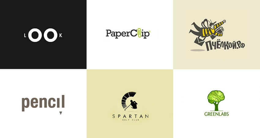
We at ColorWhistle, are also very keen when it comes to branding. We listen to the customer stories carefully and come up with the right solution for any business. Here are few examples from our branding team.
Here are a few articles about how a branding identity is developed in ColorWhistle.
A great graphic design requires a great graphic designer who also has a understanding of your business. If you have found your inspiration or are keen to discuss possibilities, we would be happy to help you with your modern logo design quest. After all when words fail, logos speak! Start your rebranding by choosing the right logo design agency so that others get inspired by your branding.
The best way to get inspired is, GET STARTED.
What’s Next?
After absorbing the insightful blog, what comes next? What action can be taken to further progress and success in this field of study? Take a moment to consider your steps forward.



I found this very engaging—keep up the good work!