We all know about publishers, right? They’re the ones who bring us books, magazines, and other written materials. But educational publishers are a bit special. They create books and other resources that help students learn.
So, why should we care about their website design?
Well, their websites are like digital classrooms. They’re where teachers and students go to find information, download materials, and connect with each other. A well-designed website can make learning more engaging and effective.
By understanding the design choices of these websites, we can learn how to create better online learning experiences. It’s like learning from the best in the business!
Explore the amazing ways tech is shaping the future of learning. Read our blog!
Here Are the Top Educational Publisher Websites with Exceptional Design
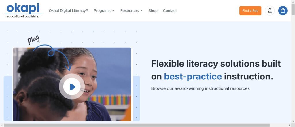
Okapi Educational Publishing
Key Features
- Interactive Elements: Engaging graphics that highlight literacy programs
- User-Friendly Navigation: Easy access to resources and event registrations
Design and Development Tech Specifications
- Built on a responsive framework that adapts to various devices
- Utilizes multimedia integration for dynamic content delivery
Okapi’s vibrant website design captures attention with its colorful layout and interactive features. The clear calls to action encourage user participation in events like their Winter Institute, enhancing community engagement.
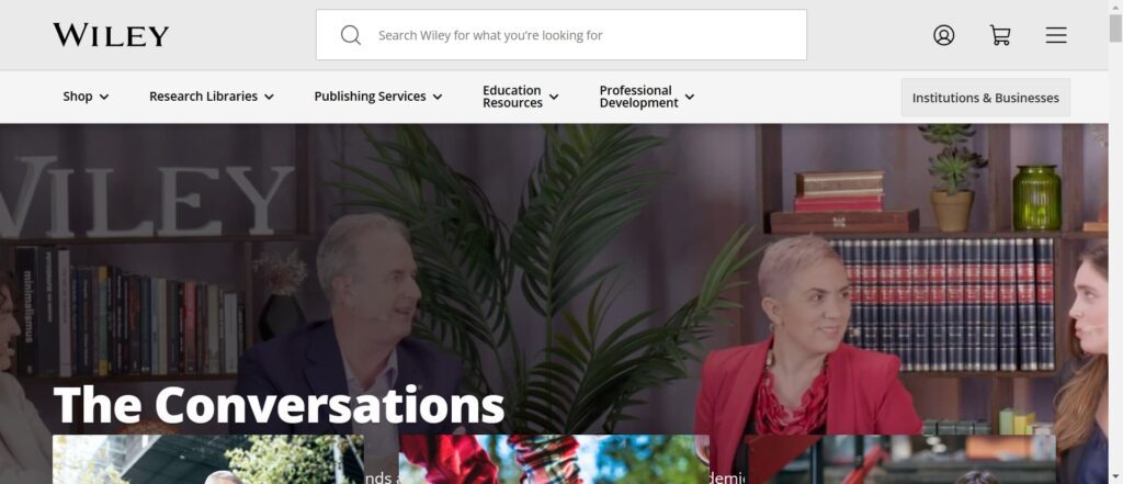
Wiley
Key Features
- Professional Aesthetic: Clean layout with bold typography
- Categorized Resources: Easy navigation through extensive educational materials
Design and Development Tech Specifications
- Developed using HTML5 and CSS3 for a responsive design
- Incorporates analytics tools to track user engagement
Wiley’s professional website design effectively categorizes its vast range of resources, making it easy for educators to find relevant materials while building credibility through user testimonials.
American Book Company
Key Features
- Search Functionality: Prominent search bar for quick access to materials
- Standards Alignment: Highlights alignment with educational standards
Design and Development Tech Specifications
- Utilizes a content management system (CMS) for easy updates
- Responsive design ensures accessibility across devices
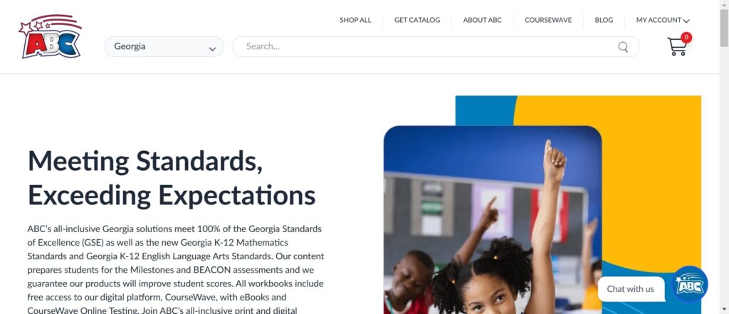
American Book Company’s focus on accessibility is evident in its user-friendly interface, allowing educators to efficiently locate specific resources tailored to their needs.
Critical Thinking Company
Key Features
- Engaging Visuals: Vibrant graphics that emphasize critical thinking skills
- Informative Blog Section: Under “Articles & Advice” with valuable insights into educational strategies
Design and Development Tech Specifications
- Built on a robust CMS that supports multimedia content
- Uses SEO best practices to enhance visibility
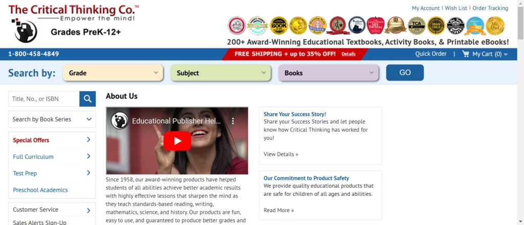
The Critical Thinking Company’s site encourages active engagement through interactive elements and informative content that positions them as thought leaders in education.
Also Read
Six Red Marbles
Key Features
- Creative Storytelling: Visuals that reflect creativity in education
- Client Testimonials: Easy access to case studies that establish credibility
Design and Development Tech Specifications
- Utilizes a modern web framework for fast loading times
- Responsive design ensures compatibility with various devices
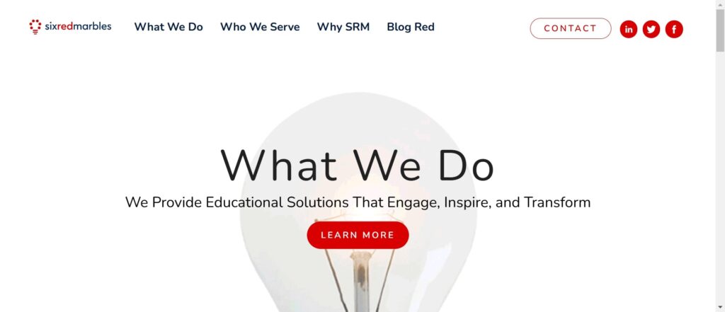
Six Red Marbles employs a modern aesthetic that emphasizes storytelling through education, engaging users with compelling graphics and videos.
Pearson
Key Features
- Personalized Content Recommendations: Tailored experiences based on user behavior
- Extensive Resource Categorization: Organized access to educational materials
Design and Development Tech Specifications
- Developed using a mobile-first approach for optimal performance on smartphones
- Incorporates data analytics tools to track user interactions
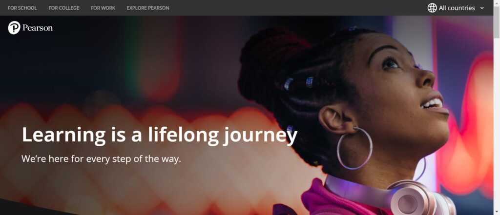
Pearson’s website excels at providing personalized experiences that resonate with individual users while maintaining an organized structure for easy navigation.
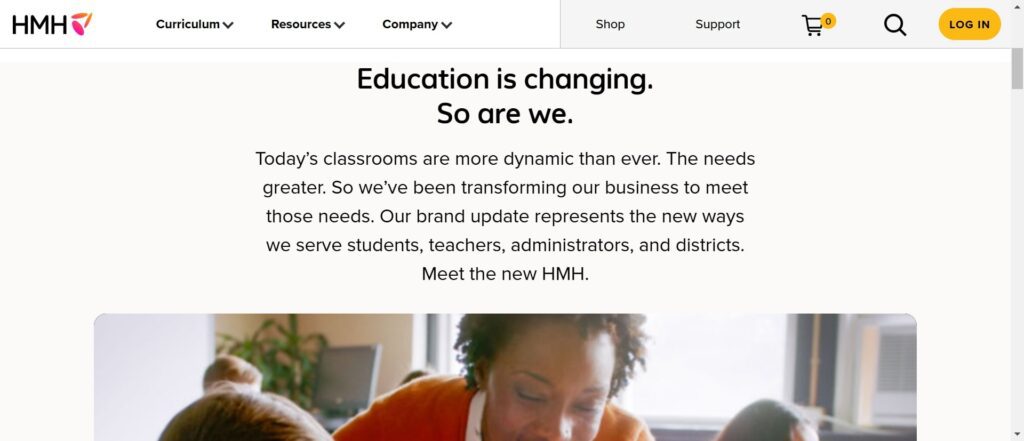
Houghton Mifflin Harcourt (HMH)
Key Features
- Community Engagement Focus: Highlights various educational initiatives
- Interactive Components: Engaging elements that guide users toward valuable resources
Design and Development Tech Specifications
- Utilizes JavaScript frameworks for dynamic content delivery
- Responsive design ensures accessibility across devices
HMH’s inviting design fosters community engagement through bright colors and interactive components that guide users toward valuable educational resources.
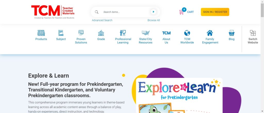
Teacher Created Materials
Key Features
- Welcoming Aesthetic: Bright colors and playful graphics appeal to teachers
- Streamlined Purchasing Process: Clear product categories facilitate easy shopping
Design and Development Tech Specifications
- Built on a robust e-commerce platform for seamless transactions
- Responsive design enhances usability on mobile devices
Teacher Created Materials creates an engaging shopping experience tailored specifically for educators, encouraging exploration of classroom resources through its inviting design.
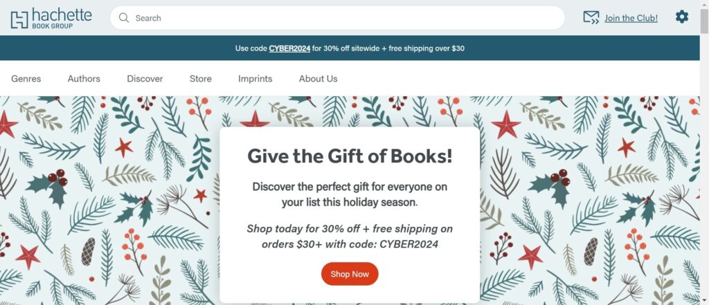
Hachette Book Group
Hachette Book Group is a top book publisher in New York and part of Hachette Livre, the world’s third-biggest publishing company.
Key Features
- Striking Imagery: High-quality visuals paired with concise messaging
- Informative Blog Section: Provides insights into educational trends
Design and Development Tech Specifications
- Developed using HTML5 for enhanced multimedia capabilities
- SEO optimized to improve search engine visibility
Hachette’s sleek website design effectively communicates its offerings while keeping users engaged with informative content beyond mere browsing.
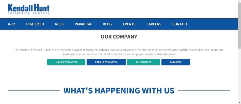
Kendall Hunt Publishing
Key Features
- Straightforward Layout: Prioritizes user experience with easy navigation
- Clear Categorization of Materials: Organized access by subject area
Design and Development Tech Specifications
- Uses a CMS for efficient content management
- Responsive design ensures accessibility across all devices
Kendall Hunt’s commitment to accessibility is reflected in its straightforward layout, enhancing overall user satisfaction through easy navigation.
Also Read
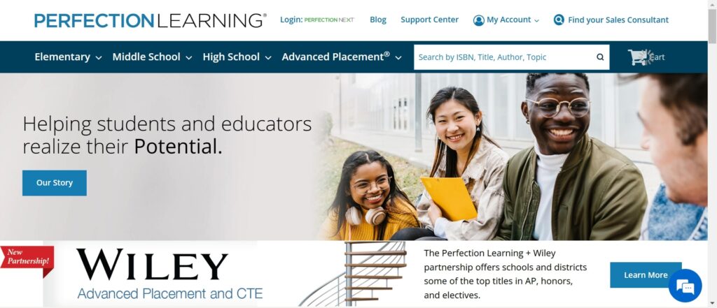
Perfection Learning
Key Features
Clear Product Descriptions: Detailed information alongside engaging visuals.
Design and Development Tech Specifications
- Utilizes responsive web design principles for optimal viewing across devices
- Built using scalable web technologies ensuring fast load times
Perfection Learning employs clarity in its product offerings, effectively conveying quality through detailed descriptions paired with engaging visuals.
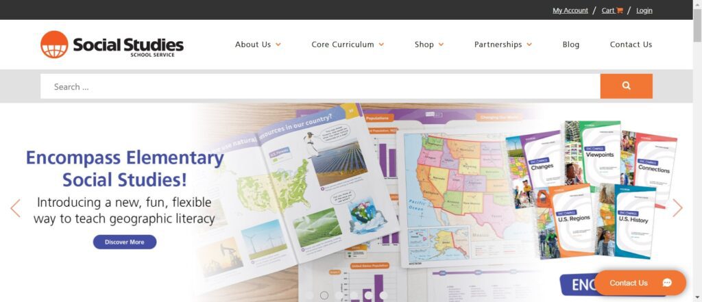
Social Studies School Service
Key Features
- Rich Content Offerings: Focuses on community engagement in social studies education
- Collaboration Tools: Encourages discussion among users through forums and feedback options
Design and Development Tech Specifications
- Developed using open-source technologies ensuring flexibility in updates
- Responsive design enhances usability across devices
This website emphasizes collaboration among educators through rich content offerings while fostering community engagement via interactive tools like forums and discussions.
Dreaming of a website that makes the honor roll? our Website Redesign Services can help you ace it with a design your audience will love!
Conclusion
The websites of top educational publishers show how good design can boost user engagement and attract more leads. These platforms draw visitors and build strong connections with educators and students by focusing on easy navigation, appealing visuals, helpful content, interactive features, personalization, and strong technology. As education moves further into the digital space, these designs set a high standard for how publishers can effectively reach their audience and share their resources.
Browse our ColorWhistle page for more related content and learn about our services. To contact us and learn more about our services, please visit our Contact Us page.
What’s Next?
Now that you’ve had the chance to explore our blog, it’s time to take the next step and see what opportunities await!
