We’ve explored the first five ways to elevate your travel website’s UX and boost lead generation.
Now, let’s get started with the next five secrets to transforming your online presence into a booking powerhouse.
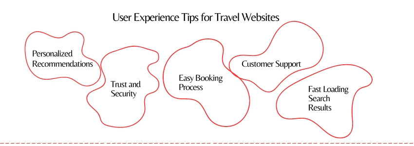
So first, utilizing data to provide tailored suggestions. This might involve proposing travel destinations that align with previous searches or suggesting accommodations that match the traveler’s preferences.
Travel can be expensive. Gain trust by showing security badges, customer reviews, and certifications. Make sure to explain your booking and cancellation rules clearly.

It’s important to have an easy booking process. Make sure there are no hidden fees, keep the form fields simple, and provide different payment choices. Look for a booking engine that is safe and easy to use.
Make sure that your search function is optimized for speed and accuracy so that users can find flights or accommodations quickly and easily.
Offer various options for customer support, like live chat, email, and phone. Being able to provide fast and effective assistance can improve the user’s experience and help establish trust.

Perfecting the Traveler’s Journey: Your Next UX Steps
Would you like to focus on a specific point in more detail? Check out our blog for a detailed view of how to enhance your UX on a travel website.
By implementing these final five UX strategies, you’ll transform your travel website into a digital oasis that not only attracts but captivates travelers. Your customers will thank you with bookings, referrals, and lasting loyalty.
Ready to elevate your travel website? Let’s create a digital masterpiece that captures hearts and drives bookings. Drop by our ColorWhistle page for exceptional website design services.
– Phurvishaa,
Content Marketing Team.

