The e-learning industry in Finland is not only focused on the domestic market but also on the global market.
Imagine an e-learning platform as a world-class chef crafting a delectable meal. The content and development, like the ingredients, are rich and diverse, carefully curated by the website development company. Now, the screen size? It’s the kitchen, ever-changing, from a spacious culinary haven (desktop) to a cozy cooking corner (smartphone). Responsive web design is the chef’s magic, ensuring that, no matter the kitchen’s size, the dish always tastes perfect. It’s the choreography that adapts content to the screen, ensuring that learners have an enjoyable meal – or learning experience – every time.
According to a report by the E-Learning Industry, Finland is one of the top 10 countries in the world for e-learning readiness and adoption. The report also highlights that Finland has a high level of internet penetration, digital literacy, educational quality, and innovation culture, which are all conducive factors for e-learning development and implementation.
E-learning, or electronic learning, has become increasingly popular in recent years due to its many benefits.
- Accessibility
- Flexibility
- Self-Paced Learning
- Cost-Effective
- Scalability
- Personalization
- Interactive Learning
- Time Efficiency
- Instant Feedback
- Global Perspective
- Environmental Impact
- Continuous Learning
Also Read
Why Responsive Web Design Matters for Finland E-Learning Websites
It’s a jungle out there in the world of education, and colleges and universities are in an all-out brawl for student attention, especially in the wild, wild digital space. You’ve got online courses, trade schools, and who-knows-what-else popping up left and right, making knowledge rain from the sky!
However, Finland educational institutions can seriously up their online game by making the switch to responsive website design. It’s like giving your website a turbo boost for better performance.
Device Diversity Ensures Seamless Performance on All Devices for E-learning Websites in Finland
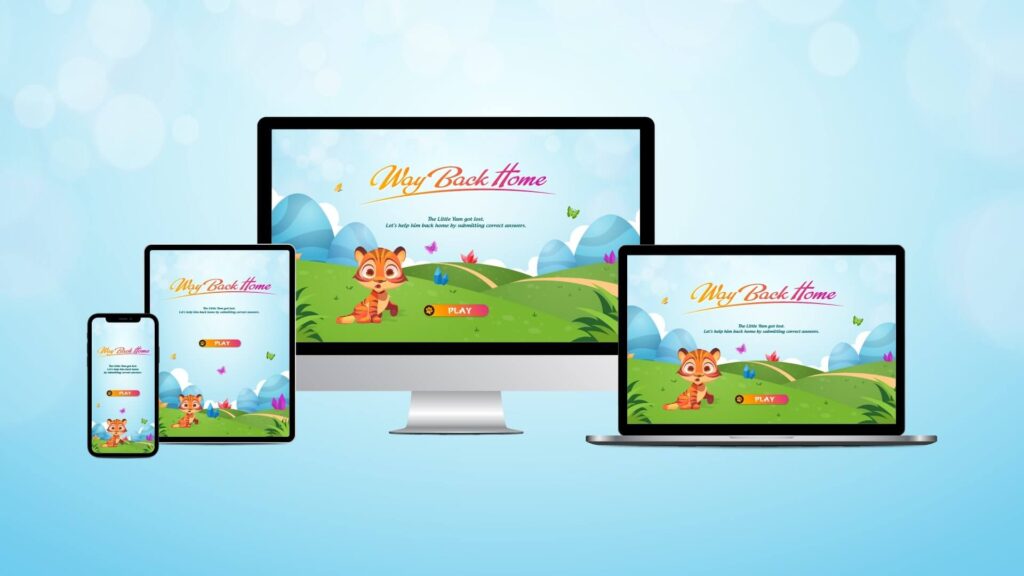
E-learners access content from a variety of devices, including smartphones, tablets, laptops, and desktop computers. Responsive design ensures that the e-learning platform adapts seamlessly to all screen sizes and orientations, providing a consistent user experience. This accessibility enhances learner convenience and encourages engagement.
Optimal User Experience Enhances Engagement and Learning for Finnish Users
Responsive design prioritizes user experience, ensuring that learners can easily navigate through course materials, access resources, and participate in interactive activities. When learners have a smooth and user-friendly experience, they are more likely to stay engaged and complete their courses successfully.
Wider Accessibility Increases Inclusivity for Diverse Devices and Abilities on E-learning Websites in Finland
Many e-learners have diverse needs and abilities. Responsive web design can incorporate accessibility features, such as text-to-speech, screen readers, and keyboard navigation, making e-learning content accessible to individuals with disabilities. Ensuring inclusivity is not only ethically important but also often legally required.
Search Engine Visibility Improves Discoverability on Search Engines for Finnish E-learning Platforms
Search engines like Google rank responsive websites in their rankings. E-learning websites that are optimized for various screen sizes tend to rank higher in search results.
Cost-Efficiency Optimizes Budget Allocation for E-learning Websites in Finland
Managing separate websites or applications for various devices can incur significant expenses and consume valuable time. Responsive design streamlines development and maintenance efforts, reducing the need for duplicate content creation and updates. This cost-effectiveness allows e-learning providers to allocate resources more efficiently.
Future-proofing your E-learning Website is Essential in Finland’s Constantly Evolving Educational Landscape
Technology evolves rapidly. New devices with different screen sizes and resolutions continually emerge. Responsive web design is forward-looking, ensuring that e-learning platforms remain functional and visually appealing as technology advances. This adaptability safeguards the platform’s longevity and relevance.
Global Reach Expands the Audience to a Global Scale for E-learning Websites in Finland
E-learning often has a global audience. Responsive design accommodates users from various regions who may use different devices. It eliminates barriers to access, making it easier for learners worldwide to engage with the content.
Consistency in Branding Strengthens Brand Recognition for Finnish E-learning Platforms
A consistent and cohesive brand image is crucial for e-learning providers. Responsive design maintains brand consistency across all devices, ensuring that the platform’s look and feel, as well as messaging, remain uniform. This consistency reinforces the brand’s identity and trustworthiness.
Analytics and Insights Provide Valuable Data for Continuous Updates in E-learning Experiences in Finland
Responsive design allows for consistent data collection and analysis across devices. This enables e-learning providers to gather insights into user behavior, preferences, and performance. Such data-driven insights can inform content improvements and marketing strategies.
Also Read
Wrap-Up
Responsive web design plays a pivotal role in the development of e-learning websites in Finland. In a nation renowned for its tech-savvy populace and stringent digital accessibility standards, the incorporation of responsive design isn’t just a choice; it’s an imperative. This strategic decision not only aligns with user expectations but also augments search engine visibility, differentiating these platforms in a fiercely competitive landscape. With Finland’s mobile-first culture and unwavering commitment to inclusivity, responsive design ensures that educational content remains easily accessible to all users, irrespective of their chosen device.
Additionally, it empowers e-learning platforms to stay ahead of the curve by adapting to emerging technologies, gathering invaluable user insights, and consistently refining the user experience. For top-tier education website development services, website design services, and website redesign services, responsive web design stands as the cornerstone of success.
Browse through our ColorWhistle page for more related content and to learn about our services. To get in touch with us and learn more about our services, please visit our Contact Us page.
What’s Next?
Now that you’ve had the chance to explore our blog, it’s time to take the next step and see what opportunities await!


