AI Summary
A Quick Summary of Vintage Logo Designs Ever-Fresh
Vintage logo design — A theme that never goes out of fashion and always has its place across the design industry. They don’t get older; they just become classics. Be it on a website or an accessory, vintage designs are always considered premium, luxurious, and lovable.
Even in this modern era, the craze for logo designs with vintage themes seems to be never-ending. Popular brands like automobiles, cafes, restaurants, beers, wineries, and many others stick to vintage logo designs.
If you want to stay on top of the mind of the audience, then vintage logos pay it off! In this article, we will discuss in detail about the vintage logo design, some forms of vintage logos with inspirations, and the effective elements of the vintage theme.
We have something more for you – Our creative logo design company services can help you to stand out from the crowd with their expertise in creating vintage logos for your business.
Let us get started.
What is Vintage Logo Design?
Vintage/retro style logo designs are a combination of artistic typography, classic shapes, and faded colors that were popular in the 60s, 70s, and 80s (similar to the examples below). Among the rest of the logo designs, vintage logos deliver a grunge or weathered look.
These vintage badges and stamps can be designed by blending shapes like circles, ovals, diamonds, shields, lines, etc with one or two faded colors. Vintage logos are a perfect choice for brands that indicate an old-fashioned approach in their business.
What Makes a Great Vintage Logo
Unlike purely modern or flat designs, vintage logos often include rich typography, decorative elements, badges, and illustrative details. What makes them work in 2026 is balance, bringing old-school aesthetics into a clean, adaptable framework that works across digital platforms.
Key aspects include:
Unique typography that feels handcrafted
Badges, frames, and ornaments that add character
Colour palettes inspired by classic print and faded tones
Illustrative touches that tell a story
These elements help brands appear more established, memorable, and approachable without feeling outdated.
Best Forms of Vintage Logo Design
Here, we have rounded up the versatile vintage logo design forms that can be the real game-changer for your business.
Texture Logos
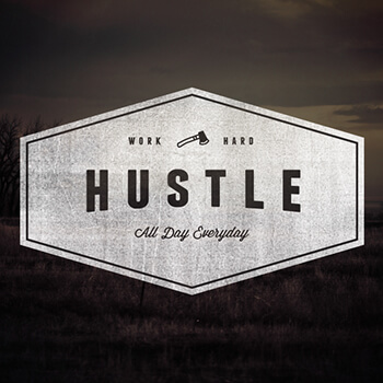
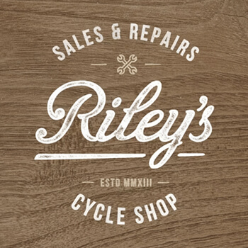
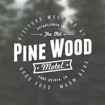
Textured logos enhance the look of the logo by helping brands to easily captivate the minds of the audience. In fact, to make their logos stand out, brands add a seamless pattern or a subtle texture or a blurred/faded image on their logo designs.
If you are a kid of the ’80s, you would not have forgotten the iconic logos like Cadbury, Coke, etc. These logos have a fine writing structure that flows freely and yet never deviates from proving its point at large.
Most of the vintage logos have a textured/blurred/ faded image or text in their designs. These logos were popularly based out of a few color tones like grey, sepia, Eastman colors, etc.
Here, we have collected a few vintage logo inspirations with texture designs.
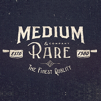

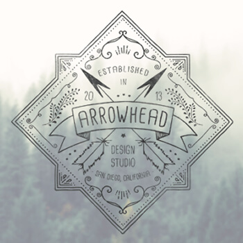

Noise Logos
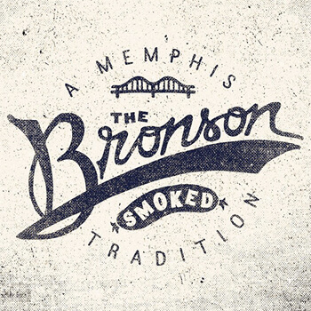
What strikes your mind when you first see a logo with grains in the background? Noise? Well, the first thing that reminds us is that it is old. Subtle and balanced use of noise/grains in the logo background or the text of the logo enhances its look and also makes the viewer feel that the logo has been given some attention to detail rather than the ubiquitous computer-made ones.
A noisy texture, grains of wood, a crumpled/stained/burnt/torn/old paper effect in the background doubles up the home-made feeling of the logo. Adding noise to the text falls under the same category. If you are looking for a vintage logo for your brand, this form is very popular and also has a lot of scope for improvement and scaling.
Get inspired by our vintage logo design collection that falls under the noise design category.
Textured Typography
Textures and patterns are an integral part of a vintage logo. Adding thin borders to text, using concentric circles, a double or triple line, hedged fonts, hand-drawn elements in the sides or in between the logo, adding a signature effect (see the Super Game or the Dan Cotton Logo), chalk piece grunge textures (The Mensch logo), using shield-type frames (The Aldo’s Logo), etc are also used to make the logo look more vintage-ish.
Here are some vintage logo inspirations that fall under this texture typography criterion.
Badge Designs
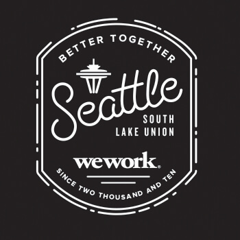
Badges and stamps are always a proud and luxurious form of vintage logo design. Companies have always used badges or stamps to portray themselves as trustable brands. These badges and stamps were paired again with textures of choice or noise to make the areas they believed need to pop-out.
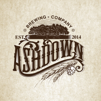
These badges had more ethnic details to it based on the industry. For example, a farm logo had an image of an actual farm in it while a distillery had wheat chaffs and brewery images in them. As there is no hard-and-fast rule of what should be there in the logo, the designers have unrestricted freedom to craft the logos that are tailored to the business needs. This form is mostly straight forward and the logo directly depicts the industry to which the company belongs. For instance, a brewery logo may incorporate elements from a brewery business plan template to ensure the visual design aligns with the company’s overall business strategy.
Here are some badge vintage logo examples you can take as inspiration.

Handwritten Typefaces
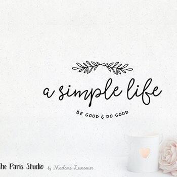
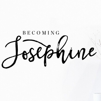
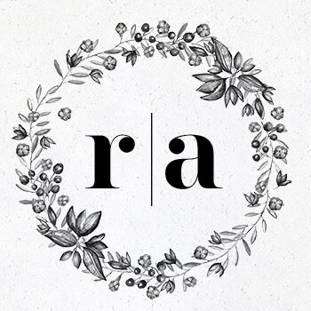
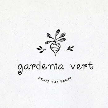
What is more personalized than a handwritten, hand-drawn logo for your business? In each era of design, designers have tried to use exquisite hand lettering and detailed drawings to enhance the richness of a logo. Even today, this legacy is followed and designing such logos with a vintage touch, is a challenging and exciting task for any designer.
Businesses like personal blogging, boutique shops, bakeries, cake shops, photography studios, florists, etc can use this style form to bring that personal, handmade, contemporary look to their logo design.
This form of design can be achieved by using extraordinary looking retro typefaces paired with subtle handmade drawing to keep the flow going in the logo. Here is a list of some free retro fonts! Have a look if any of them look like the one you need for your logo!
Here are some retro-looking handwritten logos for ideas for your next logo project.
The Love for Gears
Logos of the yester era were created in the time where there was a high industry/factory boom; times where there was a rise of labor or an industry revolution. So, the use of gears and tools played a predominant role in the creation of logos. Logo design company will analyze the clients’ requirements and design logos that best reflect their expectations.
Gears meant hard work, labor, factory, revolution, sustainability, strength, etc. Designers added gears or tools to projects which had a high involvement of man-power like manufacturing industries, automobiles, and mechanic shops which were labor-driven to show power and superiority amongst others.
Below are some of the gear-design logo inspirations for being creative on gears and tools.
Vintage Color Schemes with Strong Imagery Depictions/ Illustrations
While most of the vintage logo designs were either black-and-white or grayscale, designs were also created in colors. One of the best promising ways to create a vintage logo is to create the logo in a bright color scheme that enables you to draw the attention and keep the user’s eye interested.
To achieve this look, designers use a dual or tri-color pairing with a strong illustration of either people, places, or rarely even icons to represent their brand. The colors they used were strong and limited to the modern retro printing options those days.
In this world 30 – 40 % of the owners were small businesses, so to make them feel comfortable we are working as a small business logo design company.
The use of very few bright colors, glam up your logo to the late 1950’s or 60’s look. If you want your users to feel nostalgic after seeing your logo, then yes, this style will never disappoint you to help your brand succeed in the ‘first impression’ which is a logo.
Below is a small list of logos that matches this vintage logo form.



Typography/Lines/Borders
Brilliant typography along with a properly laid out concept gives birth to a well-designed logo. Typography, as discussed earlier, plays a vital role in laying out the perfect logo for any business. Nowadays, there are unlimited options when it comes to vintage typography. Here is a beautiful article that showcases various retro typography patterns.
Concentric lines or borders along the line of the typography brings a luxurious look to your vintage logo design. Floral art, hand-drawn borders, hand-drawn frames, detailed illustration of elements, or even an established date or year become a part of these logos.
This type of well-balanced logo is truly an accomplishment that will enable your audience to remember you for a longer period of time.

Effective Logo Elements of Vintage Theme
Before designing a logo for your business using the vintage theme, you have to acquire a firm knowledge of the various vintage theme elements.
This prior understanding of elements will be helpful to design an eye-catchy logo with a perfect vintage theme. Here, we have broken down the top 3 key elements you have to consider while designing the logo with a vintage theme.
Color Scheme
Colors captivate people toward your brand. It is also easy to trace out your niche based on the color applied. When talking about the vintage theme, the colors play a major role with regard to logo design. There is a lot of hidden psychology behind every color. For instance, blue reflects credibility and used by law and finance-related firms, green depicts nature and used by charity organizations and insurance companies.
Once you get a strong understanding of color concepts, designing the vintage logo becomes a piece of cake.
Font Style
Fonts are the communication medium through which you can interact with your target audience. They are the iconic emblems that carry your brand name to everyone in and around the world. With the combination of retro vibe fonts and vintage themes, you can create a unique brand identity.
Make sure that the font you choose exhibits bold typography. Some of the vintage typefaces include Matchbook, Atara, Jibril, Stiquez, Hemingwar, Motherline, Blessed Day, Playball, and more.
Effects
Polishing the logo with aesthetic vintage theme effects will give an ever-fading look to your brand. You can design your logo more appealing with the addition of classy effects along with the application of a scratch filter.
To Wrap Things Up
Vintage logo designs are everywhere-from marketing, ads, product packaging, websites to graphics and they are always in trend. Based on the theme it inhabits, a vintage logo depicts the overall business with the creative elements that it holds.
For decades, these have been in trend in either of its form and have always enabled the businesses to hold it with pride as their face of the business. Revisiting the forms of vintage logo design every now and then helps a designer to keep themselves updated, while for a business owner, it helps to explore various forms of logo design that are there in the field.
Have a look at all the forms, try to explore more in each of its forms. If you are looking for an exciting, unique logo for your business try to choose the best logo design services to achieve your brand popularity, contact us to discuss what best suits you!
Keep experimenting!
What’s Next?
After absorbing the insightful blog, what comes next? What action can be taken to further progress and success in this field of study? Take a moment to consider your steps forward.




Thanks! for sharing this article. It is really useful for Logo Design.
Thanks a lot for the blog article.Thanks Again. Cool.
Thank you, I’ve just been searching for info about this topic for ages and yours is the best I’ve discovered till now. But, what about the bottom line? Are you sure about the source?
You made some good points there. I did a search on the topic and found most persons will approve with your blog.