When someone says,
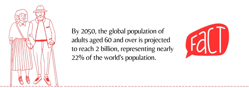
Age-friendly design, Accessible Interfaces for Older Adults, Designing Thoughtfully for Seniors, and Inclusive Experiences, all mean that your design has to cater to the one billion people aged 60 or older worldwide. Inclusivity is considered a more vital parameter than ever before in digital experiences nowadays.

Let’s see how this can be achieved.
When designing for older adults, it’s vital to avoid assumptions that may lead to oversimplified solutions.
Rather than stripping down features, our focus should be on crafting a dependable, inclusive product that empowers users of all ages to feel independent and capable.
To achieve this, we must actively involve older adults in the design process, understanding their specific needs and preferences.
By doing so, we not only cater to a specific target audience but also enhance accessibility for everyone.
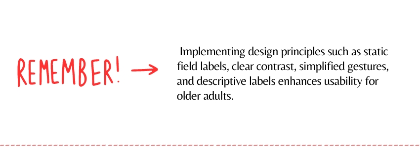
Use static field labels: Static labels are easier to read and understand, providing clarity and reducing cognitive load for older adults.
Confirm destructive actions: Older adults may be more cautious with technology, so explicit confirmation helps prevent accidental errors and frustration.

Keep gestures simple: Older hands may struggle with fine motor movements, so simpler gestures ensure they can navigate the interface comfortably.
Include a “Back” link: Adding an additional “Back” link offers an extra layer of navigation assistance, reducing confusion and making it easier to backtrack.
Provide descriptive labels: Clear labels alongside icons help older adults who may not be familiar with certain symbols, making navigation more intuitive.
Let users close disappearing messages: Ensure they have control over these messages as it prevents confusion and allows them to focus on what’s important without distractions.

Friendly error messages: Supportive error messages guide older adults through any mistakes they might make, reducing frustration and encouraging continued engagement.
Simplify forms: Breaking down forms into smaller sections reduces cognitive overload, helping older adults focus on one question or topic at a time.
Ensure contrast: Clear contrast aids older adults with declining vision, making it easier for them to differentiate between elements and read content comfortably.
Keep designing with empathy and inclusivity in mind. Here’s to crafting digital experiences that make a difference in users’ lives.
Happy Designing!!


